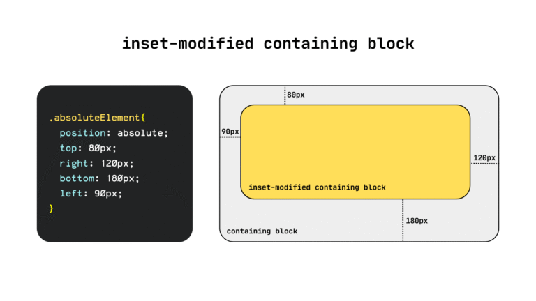
For a long time now, web developers have had to use border and pseudo-element hacks to style the gaps between the items of layouts like grid and flexbox. Today, with CSS gap decorations fully supported in Chrome and Edge, starting with version 149, you can now very easily style gaps, and with a lot of control.
Our Edge web platform team at Microsoft led both the design and standardization of the feature, and the implementation is rolling out across all Chromium-based browsers. For background, check out an early preview of gap decorations by my colleague Patrick, and a full deep dive about the stable release by my colleague Javier.
In this article, I want to share what has changed in the feature since then.
Catching up on gap decorations
Gap decorations extend the familiar column-rule CSS property, which already works in multi-column layout, and makes it work in grid and flexbox layouts too. In addition, there’s also now support for the row-rule property, so that decorations can be displayed in both axes. And finally, the syntax is extended to provide a lot more control of the decorations.
Patrick already gave a good walkthrough of the feature but, since then, a few things have changed such as property renames to make things clearer, and new properties, informed by the feedback we’ve received from web developers during early testing.
Here is a summary of the changes:
| Old | New | What this change means |
row-rule-outsetcolumn-rule-outset |
row-rule-insetcolumn-rule-inset |
“Outset” became “inset” and setting these properties now insets the rules inward from the decorations edges. |
No fine grain control of where row-rule-inset and column-rule-inset apply |
New longhand properties:row-rule-inset-caprow-rule-inset-junction row-rule-inset-startrow-rule-inset-endand column-rule-inset-capcolumn-rule-inset-junction column-rule-inset-startcolumn-rule-inset-endfor fine-grain control. |
You can now inset the outer ends (caps) and the intersections (junctions) independently. You can also inset the start and end of decorations independently. |
gap-rule-paint-order |
rule-overlap |
This property was renamed for clarity. It controls how decorations layer where row and column rules cross. |
| N/A | rule-visibility-items |
This new property controls whether rules show next to empty areas in a container. |
Browser support
Gap decorations are available in Chrome and Edge starting with version 149, and other Chromium-based browsers that match those versions.
Other browser engines have been receptive and engaged in standards venues, so over time, this feature will become interoperable.
If you’d like to use it now, I’d say:
- If you consider these decorations to be a progressive enhancement, then great! Just start using the feature today, and nothing will break on browsers that don’t support it.
- If you absolutely need gap decorations, a polyfill is in development for browsers that don’t yet have support.
Using gap decorations
Alright, enough prose, let’s expand on the demo which Patrick used in his article. We’re going to add new sections and use the latest features of gap decorations along the way.
Let’s start with some minimal HTML markup:
<body>
  <header>
    <h1>My personal site</h1>
    <p class="tagline">...</p>
  </header>

  <nav>
    <ul>
      <li><a href="#home">Home</a></li>
      <!-- etc. –>
    </ul>
  </nav>

  <section id="home" class="home">
    <div class="greeting">
      <p class="lead">...</p>
    </div>
    <div class="photo">
      <img src="cat.jpg" alt="A sleeping cat.">
    </div>
    <aside class="now">
      <h3>Currently</h3>
      <ul>
        <li>Lorem <span>— ipsum dolor sit amet</span></li>
        <!-- etc. –>
      </ul>
    </aside>
    <div class="note">
      <p>...</p>
    </div>
    <div class="photo">
      <img src="tree.jpg" alt="An old olive tree trunk.">
    </div>
  </section>

  <section id="blog" class="blog">
    <h2>Blog</h2>
    <div class="posts">
      <article class="post">
        <span class="date">June 2025</span>
        <h3>Lorem ipsum dolor</h3>
        <p>...</p>
      </article>
      <!-- rest of articles –>
    </div>
  </section>

  <section id="about" class="about">
    <h2>About</h2>
    <div class="bio">
      <img class="avatar" src="bike.jpg" alt="A bicycle leaning against a post.">
      <div class="text">
        <p>...</p>
        <!-- etc. –>
      </div>
    </div>
  </section>

  <section id="links" class="links">
    <h2>Elsewhere</h2>
    <ul>
      <li><a href="#">GitHub</a></li>
      <!-- etc. –>
    </ul>
  </section>

  <footer>
    <p>© 2025 My personal site.</p>
  </footer>
</body>
And here’s the CSS code we’ll start with. The page is one big grid, with row rules acting as section dividers. The navigation area is a flexbox layout, with dashed column rules.
body {
  display: grid;
  gap: 4rem;
  margin: 2rem;
  row-rule:
    1rem solid #efefef,
    repeat(2, 2px solid #efefef);
}


nav ul {
  display: flex;
  flex-wrap: wrap;
  gap: 2rem;
  column-rule: 2px dashed #666;
}
We’ll build on this.
Step 1: Support any number of sections with repeat(auto)
In our initial CSS, the body element uses repeat(2, 2px solid #efefef) because the site we started from had three static sections. We’re adding new sections and we want the site to automatically adapt if we keep adding sections in the future as well.
Let’s swap the hard-coded number of repeats with an auto repeater. This way the page can grow and the section divider rules just keep up:
body {
  /* ... */
  row-rule:
    1rem solid #efefef,
    repeat(auto, 2px solid #efefef);
}

Step 2: Decorate flexbox gaps in the home section
For the home section, we’ll have a wrapping flexbox container with text and images. Our .home class element defines the flexbox layout, and the various elements in it use different flex-basis:
.home {
  display: flex;
  flex-wrap: wrap;
  gap: 3rem;
}

.home > * {
  flex: 1 1 12.5rem;
}

.home .greeting {
  flex-basis: 26.25rem;
}

.home .note {
  flex-basis: 22.5rem;
}
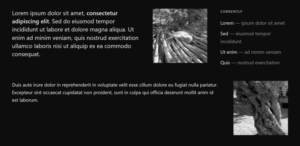
Here is the home section, without decorations:
And now, to add some gap decorations magic, let’s use the row-rule and column-rule properties:
.home {
  /* ... */
  row-rule: 2px solid #999;
  column-rule: 2px solid #999;
}
By the way, since our horizontal and vertical rules use the same value, we could collapse them into the new rule shorthand and write a single line of code:
.home {
  /* ... */
  rule: 2px solid #999;
}
We get this:
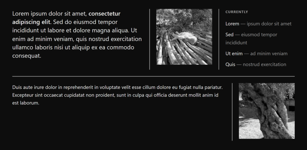
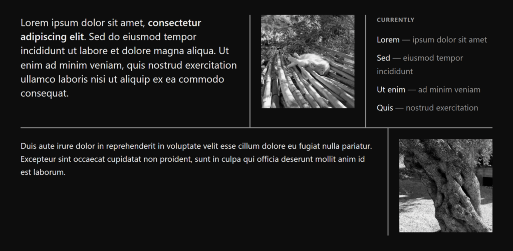
By default, the column rules run the full height of each flex line. Because we have a 3rem gap, our two flex lines are separated. I want the column rules to meet the row rule. Let’s use the column-rule-inset property and its overlap-join value. This value joins adjacent rules at the junctions, while keeping the outer ends (the caps) flush at 0.
.home {
  /* ... */
  column-rule-inset: overlap-join;
}
Step 3: Decorate spanning grid items in the blog section
For the Blog section, we’ll be using a grid so we can make specific posts span multiple columns or rows for emphasis.
.posts {
  display: grid;
  grid-template-columns: repeat(3, 1fr);
  gap: 3rem;
}

.post.feature { grid-column: span 2; }


.post.tall { grid-row: span 2; }
Here’s what the section looks like without decorations:

Just like we did in the home section, let’s add gap decorations magic:
.posts {
  /* ... */
  rule: 2px solid #999;
}
Which gets us this:

Since I don’t quite like the lines that appear next to empty grid cells, let’s get rid of them by using the new rule-visibility-items property:
.posts {
  /* ... */
  rule-visibility-items: around;
}
With this value, gap decorations will only be painted when at least one side of the gap has content so the gap between two empty cells in the last row stays clean instead of a line dangling into empty space:

Similar to the previous step, I’d like neat joins across the decorations in this grid, so I’ll reach for the overlap-join value of the rule-inset property again:
.posts {
  /* ... */
  rule-inset: overlap-join;
}
And here is the result:

Step 4: Inset decorations in the About section
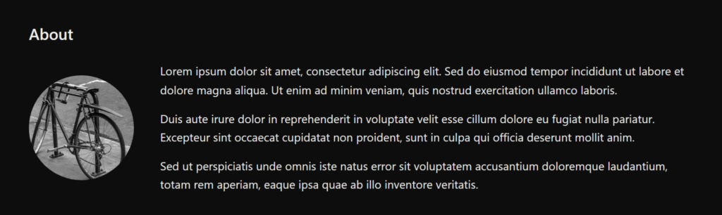
For the About section, we want a circular photo side by side with the text, separated with a line. But we’ll play with the new ability to shrink the size of gap decorations too.
First, let’s use a flexbox container to get our photo bio text side by side:
.bio {
  display: flex;
  align-items: center;
  gap: 2.5rem;
}
This gives us the following result, a sort of media card that’s commonly found on websites:
And now we apply our gap decoration:
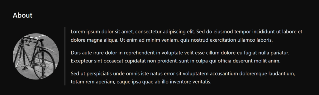
.bio {
  /* ... */
  column-rule: 2px solid #999;
 }
Which results in:
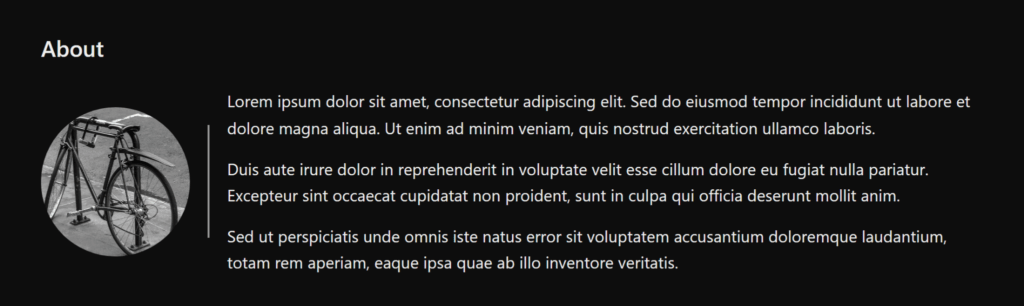
However, this time, I’d like to have a bit more breathing room, so we’ll use the column-rule-inset property to reduce the size of the separator line:
.bio {
  /* ... */
  column-rule-inset: 2.5rem;
}
And here’s the result:
Step 5: Separate links
For the Links section, since I have quite a few of those, I’ll organize them in a grid.
.links ul {
  display: grid;
  grid-template-columns: repeat(4, 1fr);
  gap: 1.5rem 2.5rem;
}
Like this:

Let’s add some gap decorations, this time making the row and column rules look different:
.links ul {
  /* ... */
  row-rule: 1px solid #c9a96a;
  column-rule: 3px solid #6a707a;
}
If you look closely, the thicker column rules appear behind the thinner row rules. I want to control this and have the column rules appear in front instead. For this let’s use the new rule-overlap property:
.links ul {
  /* ... */
  rule-overlap: column-over-row;
}
This property does exactly what it says: it lets you choose if you want columns to be painted over rows, or rows over columns.
And we get this:

Finally, I’d like the column rules to be a little shorter than the grid, but I don’t want them to be separated per row. Let’s use the column-rule-inset-cap property which controls the edges of gap decorations which aren’t junctions or intersections:
.links ul {
  /* ... */
  column-rule-inset-cap: 1.75rem;
}
And here’s the result:

Step 6: Putting it all together
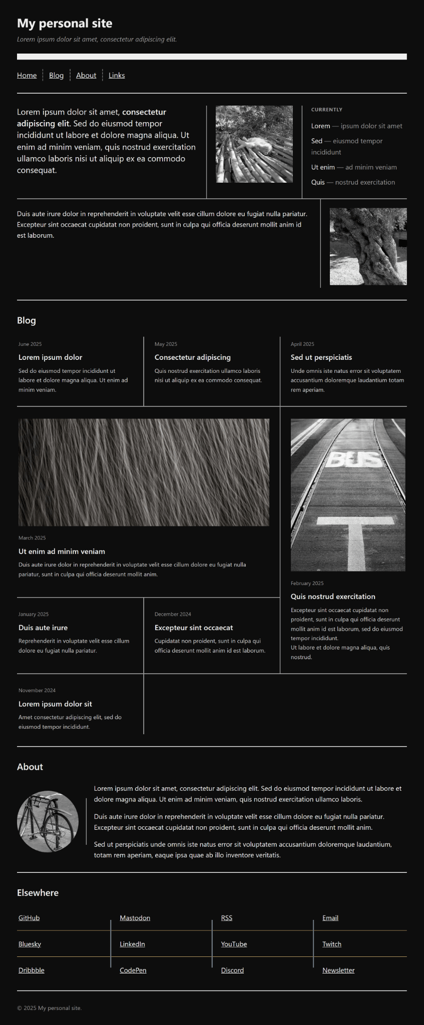
And there we have it, our webpage is ready. You can check the live example and source code:
Learn more
Give gap decorations a try. The fastest way is through the interactive playground, but we have a lot of other demos too. Play with every property and watch the gaps react in real time.
A great way to learn is to visit the MDN docs (in development at the time of writing) for more reference.
Acknowledgements
CSS Gap decorations exist because of a group of people who deeply care about the web across the Edge and Chrome teams and the CSS Working Group. Special thanks to Javier Contreras Tenorio, Kevin Babbitt, Alison Maher, Ian Kilpatrick, and Patrick Brosset.