Superscripts and subscripts are essential elements in academic and scientific content — from citation references to chemical formulas and mathematical expressions. Yet browsers handle these elements with a static approach that can create significant problems: elements become either too small on mobile devices or disproportionately large on desktop displays.
After years of wrestling with superscript and subscript scaling in CSS, I’m proposing a modern solution using fluid calculations. In this article, I’ll show you why the static approach falls short and how we can provide better typography across all viewports while maintaining accessibility. Best of all, this solution requires nothing but clean, pure CSS.
Table of Contents
The problem with static scaling
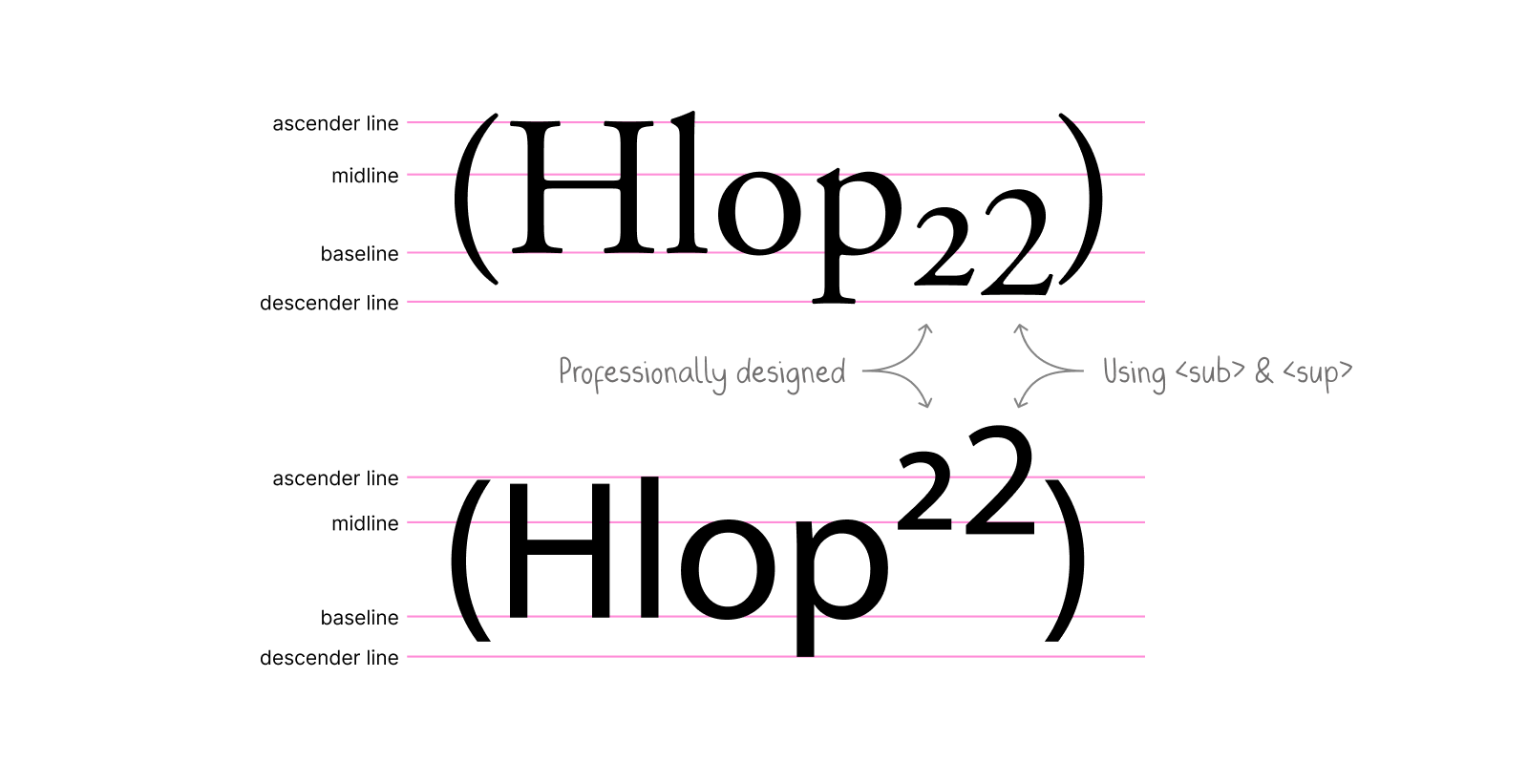
The scaling issue is particularly evident when comparing professional typography with browser defaults. Take this example (adapted from Wikipedia), where the first “2” is professionally designed and included in the glyph set, while the second uses <sub> (top) and <sup> (bottom) elements:

Browsers have historically used font-size: smaller for <sup> and <sub> elements, which translates to roughly 0.83x scaling. While this made sense in the early days of CSS for simple documents, it can create problems in modern responsive designs where font sizes can vary dramatically. This is especially true when using fluid typography, where text sizes can scale smoothly between extremes.
Fluid scaling: A better solution
I’ve developed a solution that scales more naturally across different sizes by combining fixed and proportional units. This approach ensures legibility at small sizes while maintaining proper proportions at larger sizes, eliminating the need for context-specific adjustments.
Here’s how it works:
sup, sub {
  font-size: calc(0.5em + 4px);
  vertical-align: baseline;
  position: relative;
  top: calc(-0.5 * 0.83 * 2 * (1em - 4px));
  /* Simplified top: calc(-0.83em + 3.32px) */
}

sub {
  top: calc(0.25 * 0.83 * 2 * (1em - 4px));
  /* Simplified top: calc(0.42em - 1.66px) */
}- Natural scaling: The degressive formula ensures that superscripts and subscripts remain proportional at all sizes
- Baseline alignment: By using
vertical-align: baselineand relative positioning, we prevent the elements from affecting line height and it gives us better control over the offset to match your specific needs. You’re probably also wondering where the heck these values come from — I’ll explain in the following.
Breaking down the math
Let’s look at how this works, piece by piece:
Calculating the font size (px)
At small sizes, the fixed 4px component has more impact. At large sizes, the 0.5em proportion becomes dominant. The result is more natural scaling across all sizes.
sup, sub {
  font-size: calc(0.5em + 4px);
  /* ... */
}

sub {
  /* ... */
}
Calculating the parent font size (em)
Within the <sup> and <sub> elements, we can calculate the parent’s font-size:
sup, sub {
  font-size: calc(0.5em + 4px);
  top: calc(2 * (1em - 4px));
}

sub {
  top: calc(2 * (1em + 4px));
}
The fluid font size is defined as calc(0.5em + 4px). To compensate for the 0.5em, we first need to solve 0.5em * x = 1em which gives us x = 2. The 1em here represents the font size of the <sup> and <sub> elements themselves. We subtract the 4px fixed component from our current em value before multiplying.
The vertical offset
For the vertical offset, we start with default CSS positioning values and adjust them to work with our fluid scaling:
sup, sub {
  font-size: calc(0.5em + 4px);
  top: calc(-0.5 * 0.83 * 2 * (1em - 4px));
}

sub {
  top: calc(0.25 * 0.83 * 2 * (1em - 4px));
}
The formula is carefully calibrated to match standard browser positioning:
0.5em(super) and0.25em(sub) are the default vertical offset values (e.g. used in frameworks like Tailwind CSS and Bootstrap).- We multiply by
0.83to account for the browser’sfont-size: smallerscaling factor, which is used per default for superscript and subscript.
This approach ensures that our superscripts and subscripts maintain familiar vertical positions while benefiting from improved fluid scaling. The result matches what users expect from traditional browser rendering but scales more naturally across different font sizes.
Helpful tips
The exact scaling factor font-size: (0.5em + 4px) is based on my analysis of superscript Unicode characters in common fonts. Feel free to adjust these values to match your specific design needs. Here are a few ways how you might want to customize this approach:
For larger scaling:
sup, sub {
  font-size: calc(0.6em + 3px);
  /* adjust offset calculations accordingly */
}
For smaller scaling:
sup, sub {
  font-size: calc(0.4em + 5px);
  /* adjust offset calculations accordingly */
}
For backward compatibility, you might want to wrap all of it in a @supports block:
@supports (font-size: calc(1em + 1px)) {
  sup, sub {
    ...
  }
}
Final demo
I built this small interactive demo to show different fluid scaling options, compare them to the browser’s static scaling, and fine-tune the vertical positioning to see what works best for your use case:
Give it a try in your next project and happy to hear your thoughts!


