The difference between Popovers (i.e., the popover attribute) and Dialogs (i.e., both the <dialog> element and the dialog accessible role) is incredibly confusing — so much that many articles (like this, this, and this) have tried to shed some light on the issue.
If you’re still feeling confused, I hope this one clears up that confusion once and for all.
Table of Contents
Distinguishing Popovers From Dialogs
Let’s pull back on the technical implementations and consider the greater picture that makes more sense and puts everything into perspective.
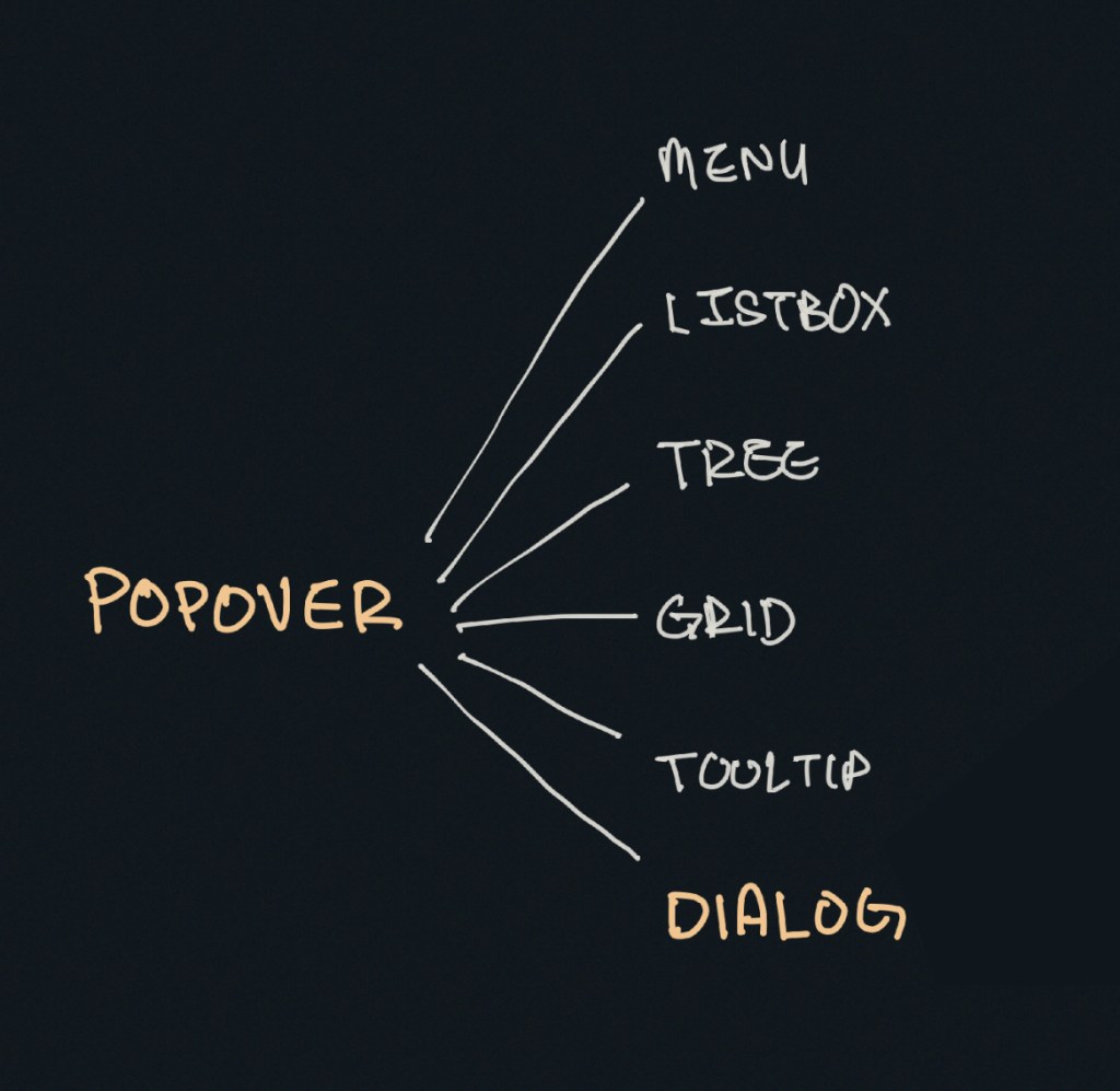
The reason for this categorization comes from a couple of noteworthy points.
First, we know that a popover is content that “pops” up when a user clicks a button (or hovers over it, or focuses on it). In the ARIA world, there is a useful attribute called aria-haspopup that categorizes such popups into five different roles:
menulistboxtreegriddialog
Strictly speaking, there’s a sixth value, true, that evaluates to menu. I didn’t include it above since it’s effectively just menu.
By virtue of dialog being on this list, we already know that dialog is a type of popover. But there’s more evidence behind this too.
The Three Types of Dialogues
Since we’re already talking about the dialog role, let’s further expand that into its subcategories:
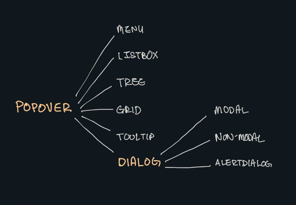
Dialogs can be categorized into three main kinds:
- Modal: A dialog with an overlay and focus trapping
- Non-Modal: A dialog with neither an overlay nor focus trapping
- Alert Dialog: A dialog that alerts screen readers when shown. It can be either modal or non-modal.
This brings us to another reason why a dialog is considered a popover.
Some people may say that popovers are strictly non-modal, but this seems to be a major misunderstanding — because popovers have a ::backdrop pseudo-element on the top layer. The presence of ::backdrop indicates that popovers are modal. Quoting the CSS-Tricks almanac:
The
::backdropCSS pseudo-element creates a backdrop that covers the entire viewport and is rendered immediately below a<dialog>, an element with thepopupattribute, or any element that enters fullscreen mode using the Fullscreen API.
That said, I don’t recommend using the Popover API for modality because it doesn’t have a showModal() method (that <dialog> has) that creates inertness, focus trapping, and other necessary features to make it a real modal. If you only use the Popover API, you’ll need to build those features from scratch.
So, the fact that popovers can be modal means that a dialog is simply one kind of popover.
A Popover Needs an Accessible Role
Popovers need a role to be accessible. Hidde has a great article on selecting the right role, but I’m going to provide some points in this article as well.
To start, you can use one of the aria-haspopup roles mentioned above:
menulistboxtreegriddialog
You could also use one of the more complex roles like:
treegridalertdialog
There are two additional roles that are slightly more contentious but may do just fine.
tooltipstatus
To understand why tooltip and status could be valid popover roles, we need to take a detour into the world of tooltips.
A Note on Tooltips
From a visual perspective, a tooltip is a popover because it contains a tiny window that pops up when the tooltip is displayed.
I included tooltip in the mental model because it is reasonable to implement tooltip with the Popover API.
<div popver role="tooltip">...</div>The tooltip role doesn’t do much in screen readers today so you need to use aria-describedby to create accessible tooltips. But it is still important because it may extend accessibility support for some software.
But, from an accessibility standpoint, tooltips are not popovers. In the accessibility world, tooltips must not contain interactive content. If they contain interactive content, you’re not looking at a tooltip, but a dialog.
You’re thinking of dialogs. Use a dialog.
Heydon Pickering, “Your Tooltips are Bogus”
This is also why aria-haspopup doesn’t include tooltip —aria-haspopup is supposed to signify interactive content but a tooltip must not contain interactive content.
With that, let’s move on to status which is an interesting role that requires some explanation.
Why status?
Tooltips have a pretty complex history in the world of accessible interfaces so there’s a lot of discussion and contention over it.
To keep things short (again), there’s an accessibility issue with tooltips since tooltips should only show on hover. This means screen readers and mobile phone users won’t be able to see those tooltips (since they can’t hover on the interface).
Steve Faulkner created an alternative — toggletips — to fill the gap. In doing so, he explained that toggletip content must be announced by screen readers through live regions.
When initially displayed content is announced by (most) screen readers that support
aria-live
Heydon Pickering later added that status can be used in his article on toggletips.
We can supply an empty live region, and populate it with the toggletip “bubble” when it is invoked. This will both make the bubble appear visually and cause the live region to announce the tooltip’s information.
<!-- Code example by Heydon -->
<span class="tooltip-container">
  <button type="button" aria-label="more info" data-toggletip-content="This clarifies whatever needs clarifying">i</button>
  <span role="status">
    <span class="toggletip-bubble">This clarifies whatever needs clarifying</span>
  </span>
</span>
This is why status can be a potential role for a popover, but you must use discretion when creating it.
That said, I’ve chosen not to include the status role in the Popover mental model because status is a live region role and hence different from the rest.
In Summary
Here’s a quick summary of the mental model:
- Popover is an umbrella term for any kind of on-demand popup.
- Dialog is one type of popover — a kind that creates a new window (or card) to contain some content.
When you internalize this, it’s not hard to see why the Popover API can be used with the dialog element.
<!-- Uses the popover API. Role needs to be determined manually -->
<div popover>...</div>

<!-- Dialog with the popover API. Role is dialog -->
<dialog popover>...</dialog>

<!-- Dialog that doesn't use the popover API. Role is dialog -->
<dialog>...</dialog>
When choosing a role for your popover, you can use one of these roles safely.
menulistboxtreegridtreegriddialogalertdialog
The added benefit is most of these roles work together with aria-haspopup which gained decent support in screen readers last year.
Of course, there are a couple more you can use like status and tooltip, but you won’t be able to use them together with aria-haspopup.

