What’s in a word? Actions. In the realm of user interfaces, a word is construed as the telltale of a control’s action. Sometimes it points us in the correct direction, and sometimes it leads us astray. We talk a lot about semantics in front-end web development, but outside of code, semantics are at the heart of copywriting where each word we convey can mean different things to different people. Words, if done right, add clarity and direction.
As a web user, I’ve come across words in user interfaces that have misled me. And not necessarily by design, either. Some words are synonymous with others and their true meaning depends entirely on context. Some words are easy to mistake for an unintended meaning because they are packed with so much meaning. A word might belong to a fellowship of interchangeable words.
Although I’m quite riled up when I misread content on a page — upset at the lack of clarity more than anything — as a developer, I can’t say I’ve always chosen the best possible words or combination of words for all the user interfaces I’ve ever made. But experience, both as a user and a developer, has elevated my commonsense when it comes to some of the literary choices I make while coding.
This article covers the words I choose for endings, to help users move away, and move on, without any confusion from the current process they are at on the screen. I went down this rabbit hole because I often find that ending something can mean many things — whether it be canceling an action, quitting an application, closing an element, navigating back, exiting a chat interaction… You get the idea. There are many ways to say that something is done, complete, and ready to move on to something else. I want to add clarity to that.
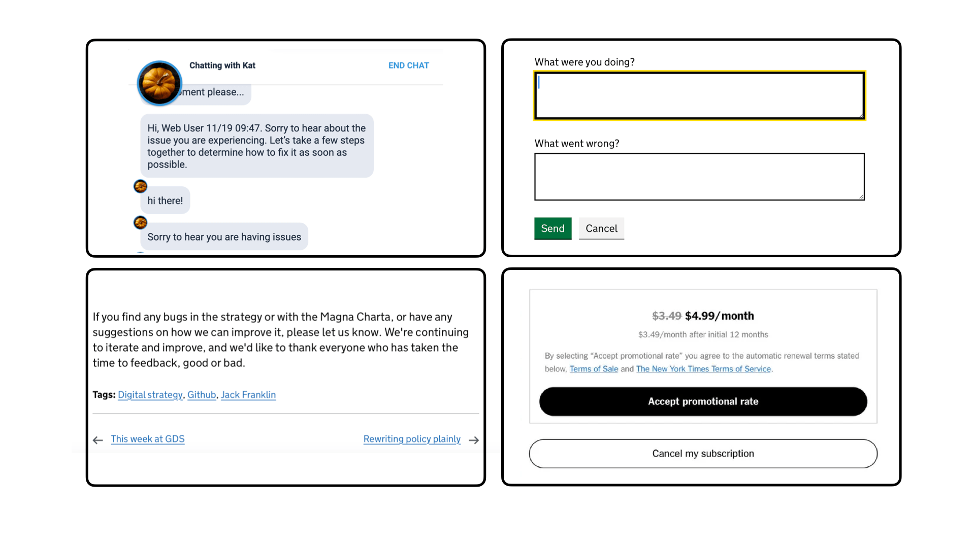
Table of Contents
Getting Canceled
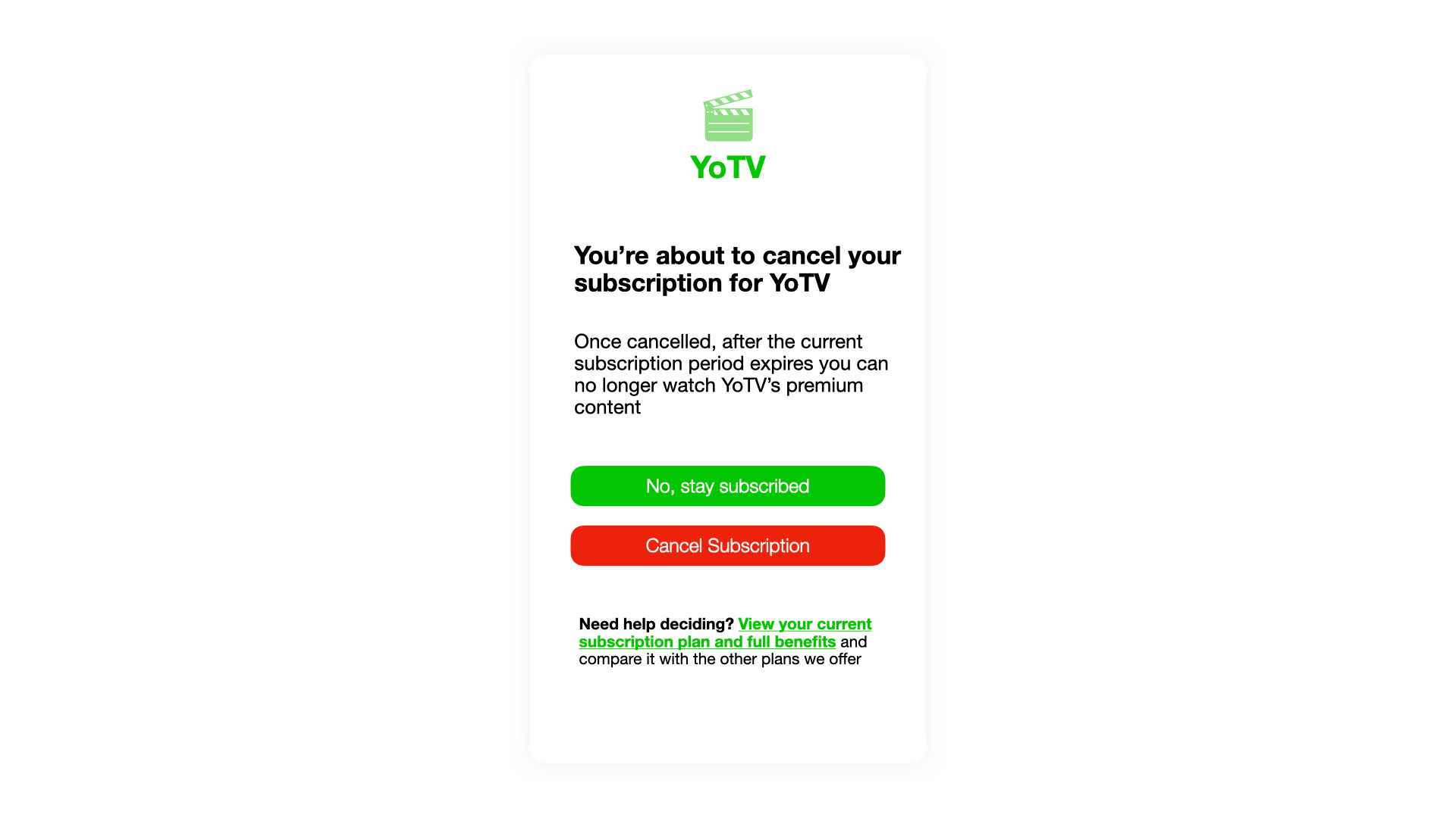
If there’s a Hall of Fame for button labels, this is the Babe Ruth of them all. “Cancel” is a widely used word to indicate an action that ends something. Cancel is a sharp, tenacious action. The person wants to bail on some process that didn’t go the way they expected it to. Maybe the page reveals a form that the person didn’t realize would be so long, so they want to back off. It could be something you have no control over whatsoever, like that person realizing they do not have their credit card information handy during checkout and they have to come back another time.
Cancel can feel personal at times, right? Don’t like the shipping costs calculated at checkout? Cancel the payment. Don’t like the newsletter? Cancel The Subscription. But really, the person only wants to undo an incorrect action or decision leaving no trace of it behind in favor of a clean slate to try again… or not.
The only times I feel betrayed by the word cancel is when the process I’m trying to end continues anyway. That comes up most when submitting forms with incorrect information. I enter something inadvertently, hit a big red Cancel button, yet the information I’ve “saved” persists to the extent that I either need to contact customer support or start looking for alternatives.
That’s the bottom line: Use “cancel” as an opportunity to confirm. It’s the person telling you, “Hey, that’s not actually what I meant to do,” and you get to step in and be the hero to wipe the mistake clean and set things up for a second chance. We’re not technically “ending” anything but rather starting clean and picking things back up for a better go. Think about that the next time you find yourself needing a label that encourages the user to try again. You might even consider synonyms that are less closely associated with closed endings, such as reset or retry.
Quitting or Exiting?
Quit window, quit tab, quit app — now we’re talking about finality. When we “quit” or “exit” something, we’re changing course. We’ve made progress in one direction and decide it’s time to chart a different path. If we’re thinking about it in terms of freeway traffic, you might say that “quitting” is akin to pulling over and killing the engine, and “exiting” is taking leaving the freeway for another road. There’s a difference, although the two terms are closely related.
As far as we’re concerned as developers, quit and exit are hard stop points in an application. It’s been put to rest. Nothing else beyond this should be possible except its rebirth when the service is restarted or reopened. So, if your page is capable of nuking the current experience and the user takes it, then quit is the better label to make that point. We’re quitting and have no plans to restart or re-engage. If you were to “quit” your job, it’s not like your employer is expecting you to report for duty on Monday… or any other day for that matter.
But here’s my general advice about the word quit: only use it if you have to. I see very few use cases where we actually want to offer someone a true way to quit something. It’s so effective at conveying finality in web interfaces that it shuts the door on any future actions. For instance, I find that cancel often works in its place. And, personally, I find that saying “cancel payment” is more widely applicable. It’s softer and less rigid in the sense that it leaves the possibility to resume a process down the road.
Quit is also a simple process. Just clear everything and be gone. But if quitting means the user might lose some valuable data or progress, then that’s something they have to be warned about. In that case, exit and save may be better guidance.
I consider Exit the gentler twin of Quit. I prefer Quit just for the ultimatum of it. I see Exit used less frequently in interfaces than I see Quit. In rare cases, I might see Exit used specifically because of its softer nature to Quit even though “quitting” is the correct semantic choice given that the user really wants to wipe things clean and the assurance that nothing is left behind. Sometimes a “tougher” term is more reassuring.
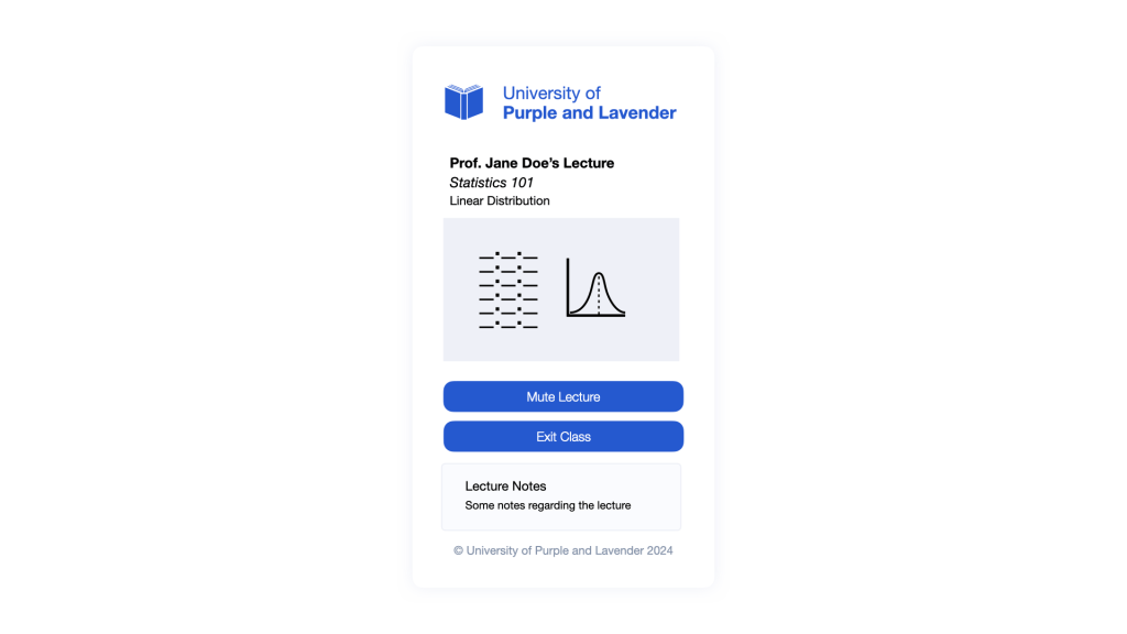
Exit, however, is an excellent choice for actions that represent the end of human-to-human interactions — things like Exit Group, Exit Chat, Exit Streaming, Exit Class. If this person is kindly saying goodbye to someone or something but open to future interactions, allow them to exit when they’re done. They’re not quitting anything and we aren’t shoving them out the door.
Going Back (and Forth)
Let’s talk about navigation. That’s the way we describe moving around the internet. We navigate from one place to another, to another, to another, and so on. It’s a journey of putting one digital foot in front of the other on the way to somewhere. That journey comes to an end when we get to our destination… or when we “quit” or “exit” the journey as we discussed above.
But the journey may take twists and turns. Not all movement is linear on the web. That’s why we often leave breadcrumbs in interfaces, right? It’s wayfinding on the web and provides people with a way to go “back” where they came from. Maybe that person forgot a step and needs to head back in order to move forward again.
In other words, back displaces people — laterally and hierarchically. Laterally, back (and its synonym, previous), backtracks across the same level in a process, for instance, between two sections of the same form, or two pages of the same document. Hierarchically, back — not to mention more explicit variants like “home” — is a level above that in the navigation hierarchy.
I like the explicit nature of saying something like “Home” when it comes to navigating someone “back” to a location or state. There’s no ambiguity there: hey, let’s go back home. Being explicit opens you up to more verbose labels but brevity isn’t always the goal. Even in iconography, adding more detail to a visual can help add clarity. The same is true with content in user interfaces. My favorite example is the classic “Back to Top” button on many pages that navigate you to the “top” of the page. We’re going “back to the top” which would not have been clear if we had used “Back” alone. Back where? That’s an important question — particularly when working with in-page anchors — and the answer may not be as obvious to others as it is to you. Communicating that level of hierarchy explicitly is a navigational feature.
While the “Back to Top” example I gave is a better illustration of lateral displacement than hierarchical displacement, I tend to avoid the label back with any sort of lateral navigation because moving laterally typically involves navigating between states more than navigating between pages. For example, the user may be navigating from a “logged in” state to a “logged out” state. In this case, I prefer being even more explicit — e.g., Save and Go Back, or Cancel and Go Home — than hierarchical navigation because we’re changing states on top of moving away from something.
Closing Down
Close is yet another term you’ll find in the wild for conveying the “end” of something. It’s quite similar to Back in the sense that it serves dual purposes. It can be for navigation — close the current page and go back — or it can be for canceling an action — close the current page, and either discard or save all the data entered so far.
I prefer Close for neither of those cases. If we’re in the context of navigation, I like the clarity of the more explicit guidance we discussed above, e.g., Go Back, Previous, or Go Home. Giving someone an instruction to Close doesn’t say where that person is going to land once navigating away from the current page. And if we’re dealing with actions, Save and Close affirms the person that their data will be saved, rather than simply “closing” it out. If we were to simply say “cancel” instead, the insinuation is that the user is quitting the action and can expect to lose their work.
The one time I do feel that “Close” is the ideal label is working with pop-up dialogues and modals. Placing “Close” at the top-right (or the block-start, inline-end edge if we’re talking logical directions) corner is more than clear enough about what happens to the pop-up or modal when clicking it. We can afford to be a little less explicit with our semantics when someone’s focus is trapped in a specific context.
The End.
I’ve saved the best for last, right? There’s no better way to connote an ending than simply calling it the “end”. It works well when we pair it with what’s ending.
End Chat. End Stream. End Webinar.
You’re terminating an established connection, not with a process, but with a human. And this is not some abrupt termination like Quit or Cancel. It’s more of a proper goodbye. Consider it also a synonym to Exit because the person ending the interaction may simply be taking a break. They’re not necessarily quitting something for good. Let’s leave the light on the front patio for them to return later and pick things back up..
And speaking of end, we’ve reached the end of this article. That’s the tricky, but liberating, thing about content semantics — some words may technically be correct but still mislead site visitors. It’s not that we’re ever trying to give someone bad directions, but it can still happen because this is a world where there are many ways of saying the same thing. Our goal is to be unambiguous and the milestone is clarity. Settling on the right word or combination of words takes effort. Anyone who has struggled with naming things in code knows about this. It’s the same for naming things outside of code.
I did not make an attempt to cover each and every word or way to convey endings. The point is that our words matter and we have all the choice and freedom in the world to find the best fit. But maybe you’ve recently run into a situation where you needed to “end” something and communicate that in an interface. Did you rely on something definitive and permanent (e.g. quit) or did you find that softer language (e.g. exit) was the better direction? What other synonyms did you consider? I’d love to know!
End Article.