Last time, I asked, “Why do so many long-form articles feel visually flat?” I explained that:
“Images in long-form content can (and often should) do more than illustrate. They can shape how people navigate, engage with, and interpret what they’re reading. They help set the pace, influence how readers feel, and add character that words alone can’t always convey.”
Then, I touched on the expressive possibilities of CSS Shapes and how, by using shape-outside, you can wrap text around an image’s alpha channel to add energy to a design and keep it feeling lively.
There are so many creative opportunities for using shape-outside that I’m surprised I see it used so rarely. So, how can you use it to add personality to a design? Here’s how I do it.
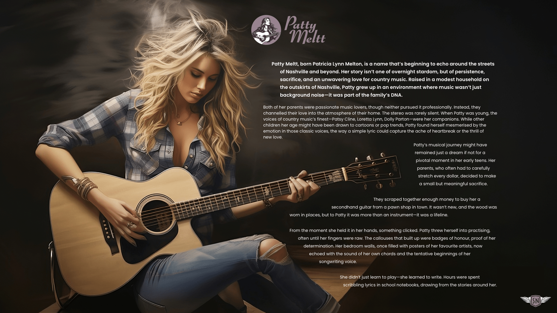
My brief: Patty Meltt is an up-and-coming country music sensation, and she needed a website to launch her new album and tour. She wanted it to be distinctive-looking and memorable, so she called Stuff & Nonsense. Patty’s not real, but the challenges of designing and developing sites like hers are.
Most shape-outside guides start with circles and polygons. That’s useful, but it answers only the how. Designers need the why — otherwise it’s just another CSS property.
Whatever shape its subject takes, every image sits inside a box. By default, text flows above or below that box. If I float an image left or right, the text wraps around the rectangle, regardless of what’s inside. That’s the limitation shape-outside overcomes.
shape-outside lets you break free from those boxes by enabling layouts that can respond to the contours of an image. That shift from images in boxes to letting the image content define the composition is what makes using shape-outside so interesting.
Solid blocks of text around straight-edged images can feel static. But text that bends around a guitar or curves around a portrait creates movement, which can make a story more compelling and engaging.
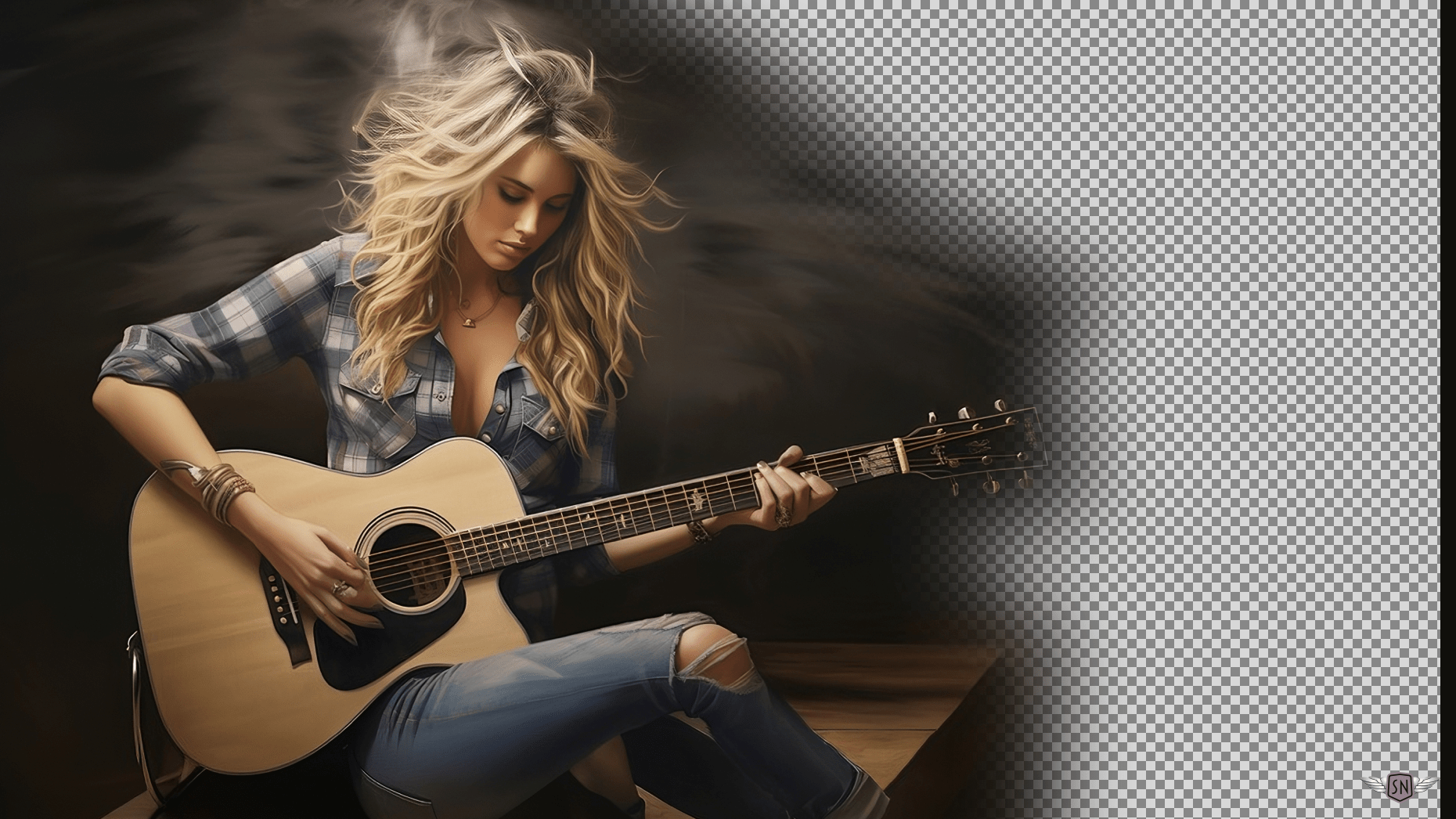
CSS shape-outside enables text to flow around any custom shape, including an image’s alpha channel (i.e., the transparent areas):
img {
  float: left;
  width: 300px;
  shape-outside: url('patty.webp');
  shape-image-threshold: .5;
  shape-margin: 1rem;
}
First, a quick recap.
For text to flow around elements, they need to float either left or right and have their width defined. The shape-outside URL selects an image with an alpha channel, such as a PNG or WebP. The shape-image-threshold property sets the alpha channel threshold for creating a shape. Finally, there’s the shape-margin property which — believe it or not — creates a margin around the shape.
Interactive examples from this article are available in my lab.
Multiple image shapes
Table of Contents
When I’m adding images to a long-form article, I ask myself, “How can they help shape someone’s experience?” Flowing text around images can slow people down a little, making their experience more immersive. Visually, it brings text and image into a closer relationship, making them feel part of a shared composition rather than isolated elements.
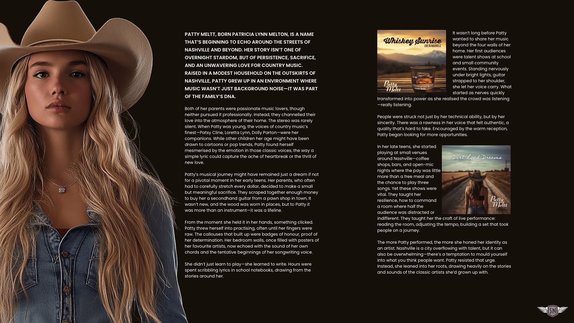
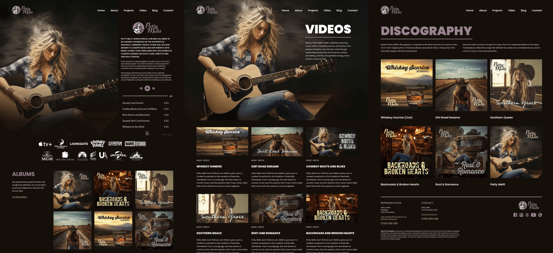
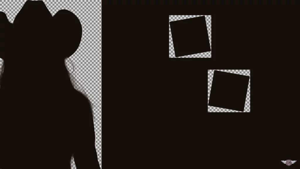
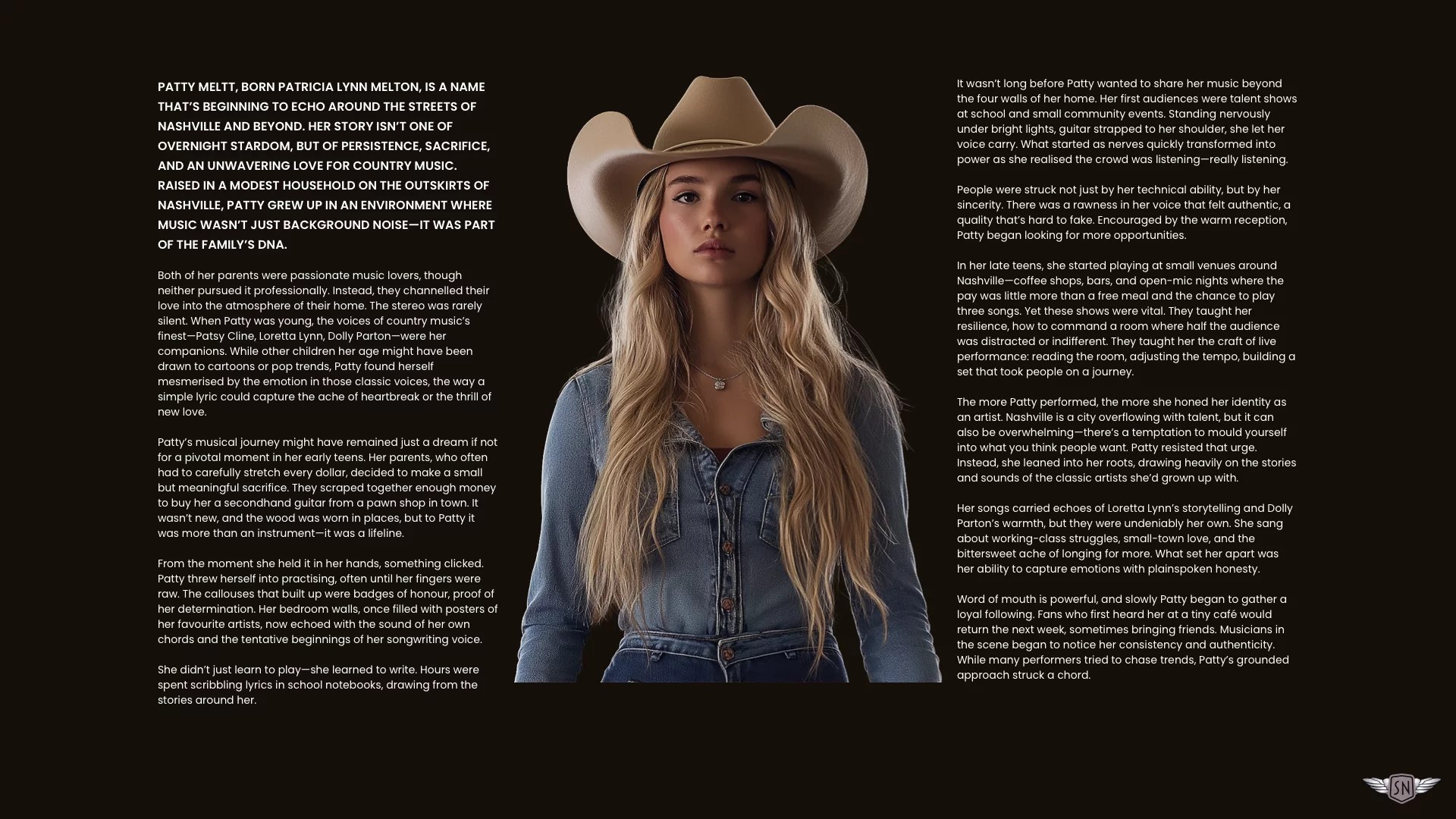
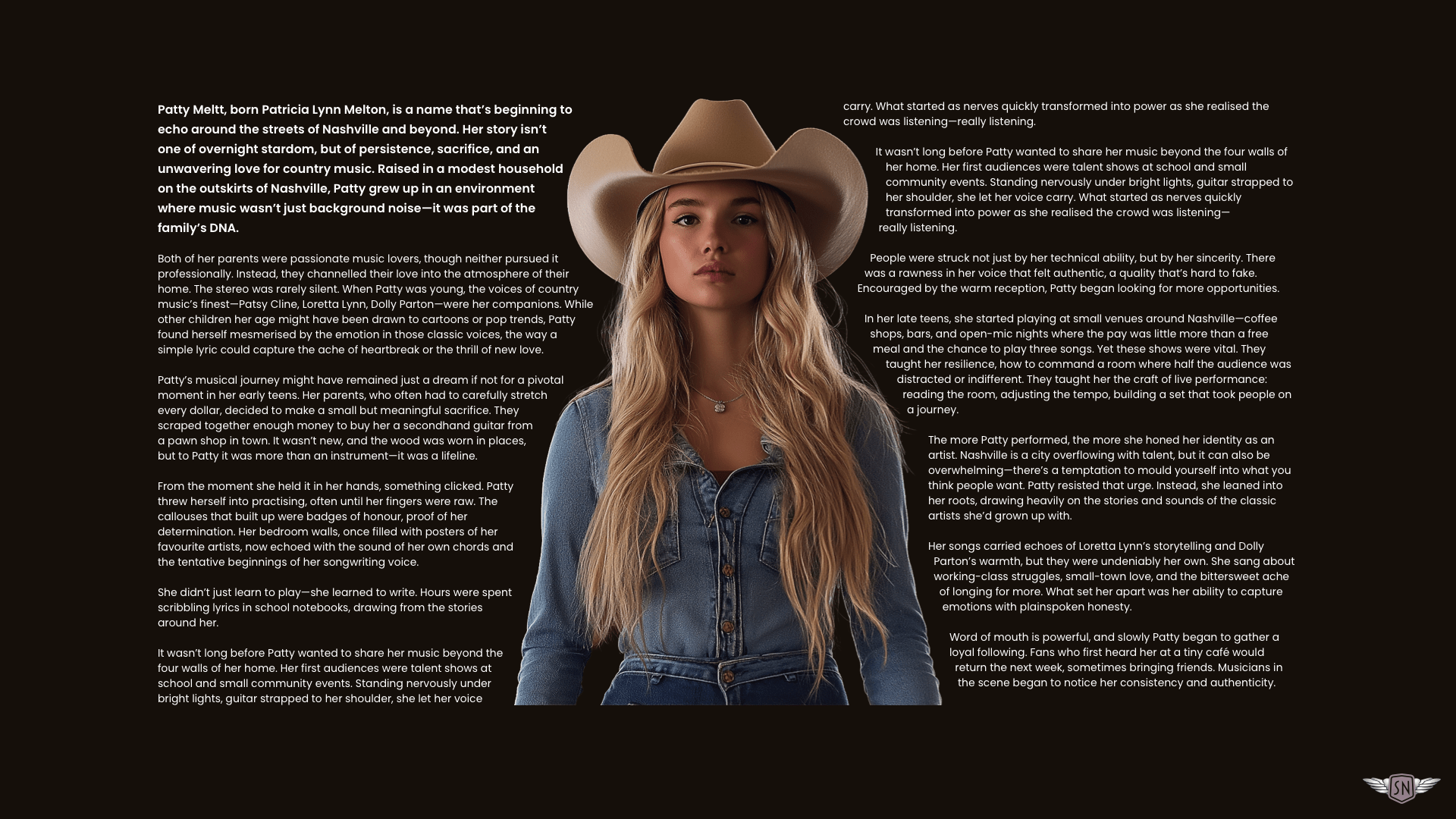
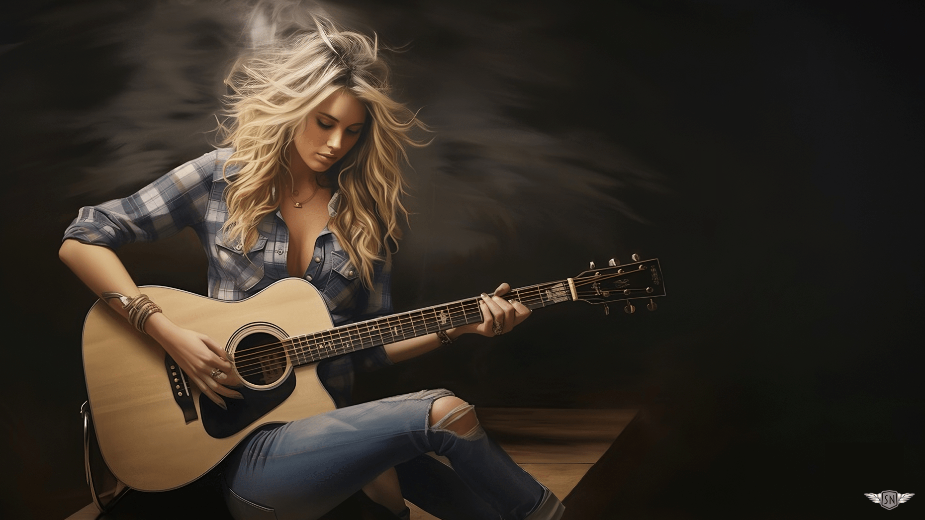
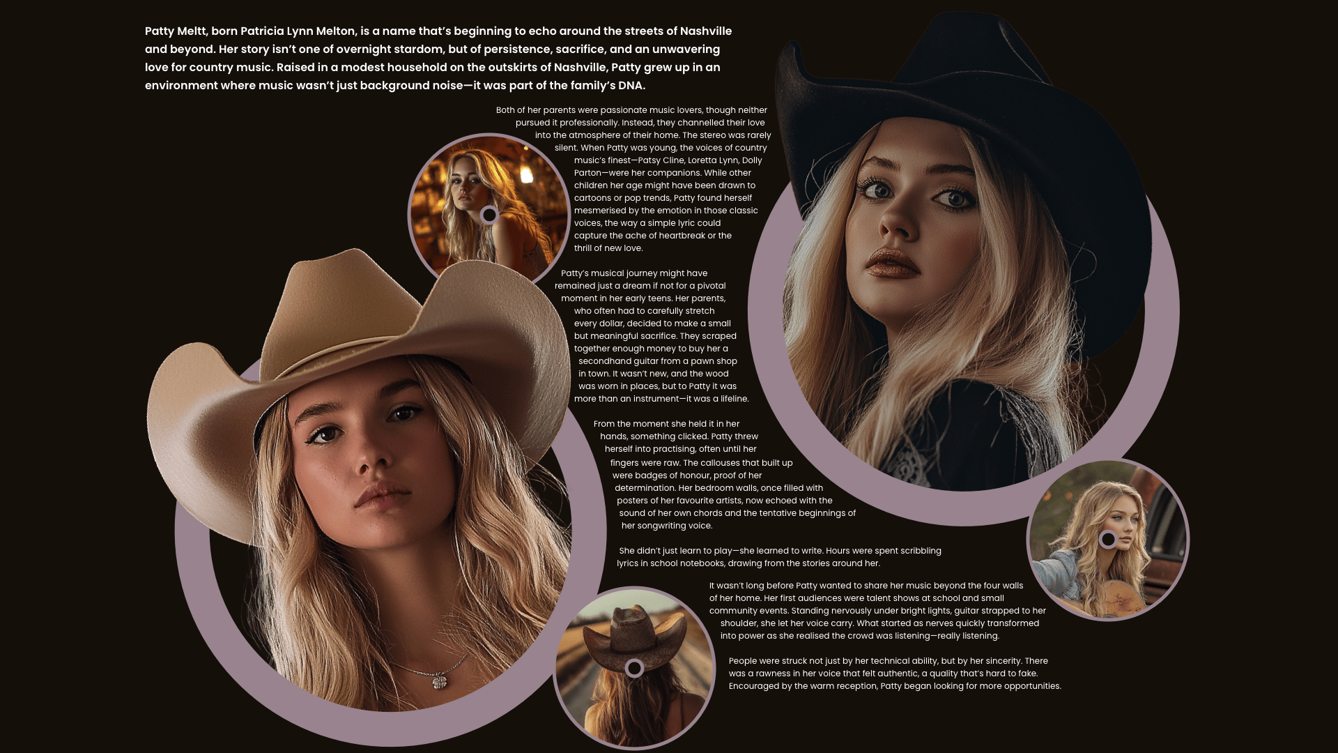
shape-outside applied to themPatty’s life story — from singing in honky-tonks to headlining stadiums — contains two sections: one about her, the other about her music. I added a tall vertical image of Patty to her biography and two smaller album covers to the music column:
<section id="patty">
  <div>
    <img src="patty.webp" alt="">
    [...]
  </div>

  <div>
    <img src="album-1.webp" alt="">
    [...]
    <img src="album-2.webp" alt="">
    [...]
  </div>
</section>
A simple grid then creates the two columns:
#patty {
  display: grid;
  grid-template-columns: 2fr 1fr;
  gap: 5rem;
}
I like to make my designs as flexible as I can, so instead of specifying image widths and margins in static pixels, I opted for percentages on those column widths so their actual size is relative to whatever the size of the container happens to be:
#patty > *:nth-child(1) img {
  float: left;
  width: 50%;
  shape-outside: url("patty.webp");
  shape-margin: 2%;
}

#patty > *:nth-child(2) img:nth-of-type(1) {
  float: left;
  width: 45%;
  shape-outside: url("album-1.webp");
  shape-margin: 2%;
}

#patty > *:nth-child(2) img:nth-of-type(2) {
  float: right;
  width: 45%;
  shape-outside: url("album-2.webp");
  shape-margin: 2%;
}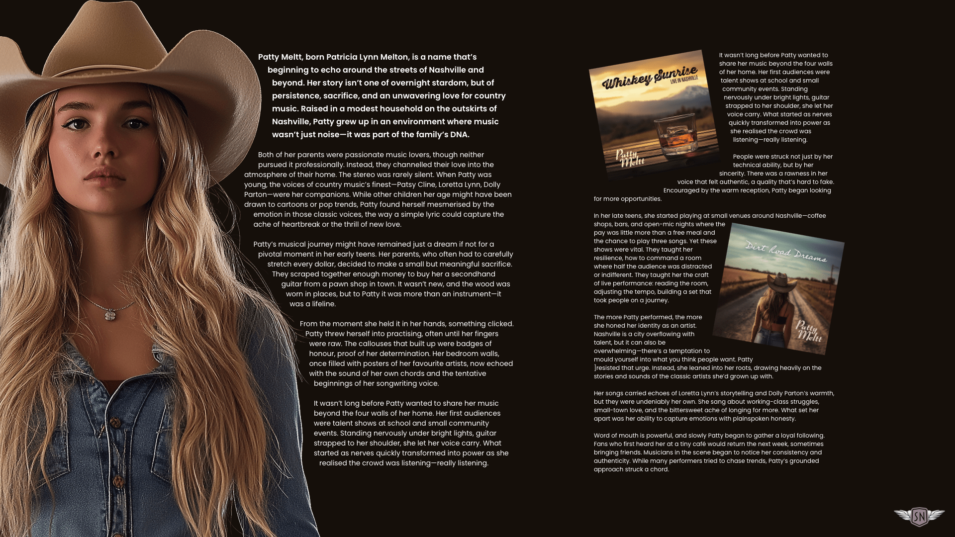
shape-outside applied to them. See this example in my lab.Text now flows around Patty’s tall image without clipping paths or polygons — just the natural silhouette of her image shaping the text.
When an image is rotated using a CSS transform, ideally, browsers would reflow text around its rotated alpha channel. Sadly, they don’t, so it’s often necessary to build that rotation into the image.
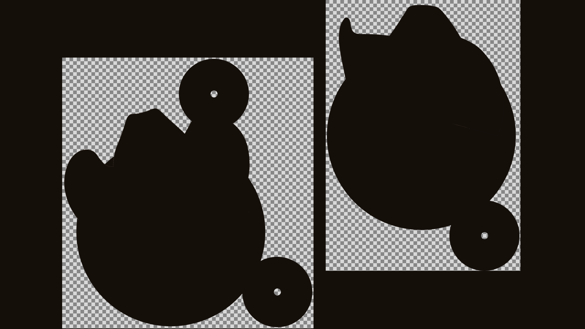
shape-outside with a faux-centred image
For text to flow around elements, they need to be floated either to the left or right. Placing an image in the centre of the text would make Patty’s biography design more striking. But there’s no center value for floats, so how might this be possible?
Patty’s bio content is split across two symmetrical columns:
#dolly {
  display: grid;
  grid-template-columns: 1fr 1fr;
}
To create the illusion of text flowing around both sides of her image, I first split it into two parts: one for the left and the other for the right, both of which are half, or 50%, of the original width.
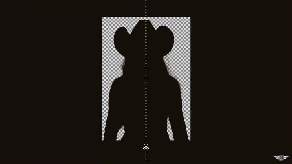
Then I placed one image in the left column, the other in the right:
<section id="dolly">
  <div>
    <img src="patty-left.webp" alt="">
    [...]
  </div>

  <div>
    <img src="patty-right.webp" alt="">
    [...]
  </div>
</section>
To give the illusion that text flows around both sides of a single image, I floated the left column’s half to the right:
#dolly > *:nth-child(1) img {
  float: right;
  width: 40%;
  shape-outside: url("patty-left.webp");
  shape-margin: 2%;
}
…and the right column’s half to the left, so that both halves of Patty’s image combine right in the middle:
#dolly > *:nth-child(2) img {
  float: left;
  width: 40%;
  shape-outside: url("patty-right.webp");
  shape-margin: 2%;
}
Faux background image
So far, my designs for Patty’s biography have included a cut-out portrait with a clearly defined alpha channel. But, I often need to make a design that feels looser and more natural.
Ordinarily, I would place a picture as a background-image, but for this design, I wanted the content to flow loosely around Patty and her guitar.
So, I inserted Patty’s picture as an inline image, floated it, and set its width to 100%;
<section id="kenny">
  <img src="patty.webp" alt="">
  [...]
</section>
#kenny > img {
float: left;
width: 100%;
max-width: 100%;
}There are two methods I might use to flow text around Patty and her guitar. First, I might edit the image, removing non-essential parts to create a soft-edged alpha channel. Then, I could use the shape-image-threshold property to control which parts of the alpha channel form the contours for text wrapping:
#kenny > img {
  shape-outside: url("patty.webp");
  shape-image-threshold: 2;
}
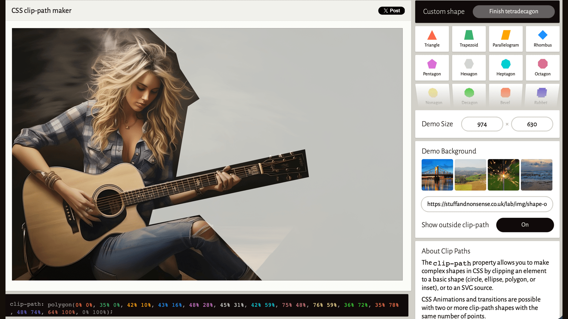
However, this method is destructive, since much of the texture behind Patty is removed. Instead, I created a polygon clip-path and applied that as the shape-outside, around which text flows while preserving all the detail of my original image:
#kenny > img {
  float: left;
  width: 100%;
  max-width: 100%;
  shape-outside: polygon(…);
  shape-margin: 20px;
}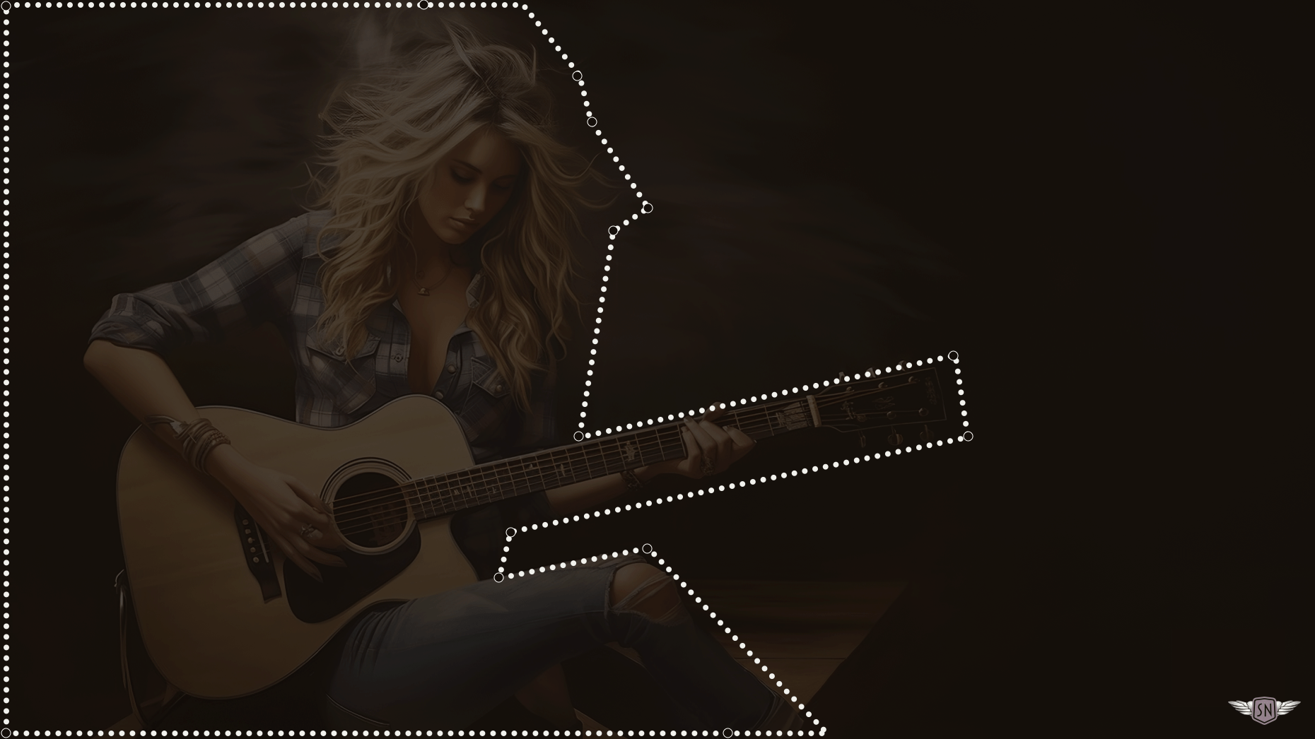
clip-path.I have little time for writing polygon path points by hand, so I rely on Bennett Feely’s CSS clip-path maker. I add my image URL, draw a custom polygon shape, then copy the clip-path values to my shape-outside property.
Text between shapes
Patty Meltt likes to push the boundaries of country music, and I wanted to do the same with my design of her biography. I planned to flow text between two photomontages, where elements overlap and parts of the images spill out of their containers to create depth.
So, I made two montages with irregularly shaped alpha channels.
I placed both images above the content:
<section id="johnny">
  <img src="patty-1.webp" alt="">
  <img src="patty-2.webp" alt="">
  […]
</section>
…and used those same image URLs as values for shape-outside:
#johnny img:nth-of-type(1) {
  float: left;
  width: 45%;
  shape-outside: url("patty-1.webp");
  shape-margin: 2%;
}

#johnny img:nth-of-type(2) {
  float: right;
  width: 35%;
  shape-outside: url("img/patty-2.webp");
  shape-margin: 2%;
}
Content now flows like a river in a country song, between the two image montages, filling the design with energy and movement.
Conclusion
Too often, images in long-form content end up boxed in and isolated, as if they were dropped into the page as an afterthought. CSS Shapes — and especially shape-outside — give us a chance to treat images and text as part of the same composition.
This matters because design isn’t just about making things usable; it’s about shaping how people feel. Wrapping text around the curve of a guitar or the edge of a portrait slows readers down, invites them to linger, and makes their experience more immersive. It brings rhythm and personality to layouts that might otherwise feel flat.
So, next time you reach for a rectangle, pause and think about how shape-outside can help turn an ordinary page into something memorable.