As a developer with a passion for state machines, I’ve often found myself inspired by articles like “A Complete State Machine Made with HTML Checkboxes and CSS.” The power of pure CSS-driven state machines intrigued me, and I began to wonder: could I create something simpler, more interactive, and without the use of macros? This led to a project where I built an elevator simulation in CSS, complete with direction indicators, animated transitions, counters, and even accessibility features.
In this article, I’ll walk you through how I used modern CSS features — like custom properties, counters, the :has() pseudo-class, and @property — to build a fully functional, interactive elevator that knows where it is, where it’s headed, and how long it’ll take to get there. No JavaScript required.
Defining the State with CSS Variables
Table of Contents
- 1 Defining the State with CSS Variables
- 2 A Simple UI: Radio Buttons for Floors
- 3 Motion via Dynamic Variables
- 4 Determining Direction and Arrow Behavior
- 5 Simulating Memory with --delay
- 6 Floor Counters and Unicode Styling
- 7 Accessibility with aria-live
- 8 Practical Applications of These Techniques
- 9 Final Thoughts
The backbone of this elevator system is the use of CSS custom properties to track its state. Below, I define several @property rules to allow transitions and typed values:
@property --current-floor {
  syntax: "<integer>";
  initial-value: 1;
  inherits: true;
}

@property --previous {
  syntax: "<number>";
  initial-value: 1;
  inherits: true;
}

@property --relative-speed {
  syntax: "<number>";
  initial-value: 4;
  inherits: true;
}

@property --direction {
  syntax: "<integer>";
  initial-value: 0;
  inherits: true;
}
These variables allow me to compare the elevator’s current floor to its previous one, calculate movement speed, and drive animations and transitions accordingly.
A regular CSS custom property (--current-floor) is great for passing values around, but the browser treats everything like a string: it doesn’t know if 5 is a number, a color, or the name of your cat. And if it doesn’t know, it can’t animate it.
That’s where @property comes in. By “registering” the variable, I can tell the browser exactly what it is (<number>, <length>, etc.), give it a starting value, and let it handle the smooth in-between frames. Without it, my elevator would just snap from floor to floor, and that’s not the ride experience I was going for.
A Simple UI: Radio Buttons for Floors
Radio buttons provide the state triggers. Each floor corresponds to a radio input, and I use :has() to detect which one is selected:
<input type="radio" id="floor1" name="floor" value="1" checked>
<input type="radio" id="floor2" name="floor" value="2">
<input type="radio" id="floor3" name="floor" value="3">
<input type="radio" id="floor4" name="floor" value="4">
.elevator-system:has(#floor1:checked) {
--current-floor: 1;
--previous: var(--current-floor);
}
.elevator-system:has(#floor2:checked) {
--current-floor: 2;
--previous: var(--current-floor);
}This combination lets the elevator system become a state machine, where selecting a radio button triggers transitions and calculations.
Motion via Dynamic Variables
To simulate elevator movement, I use transform: translateY(...) and calculate it with the --current-floor value:
.elevator {
  transform: translateY(calc((1 - var(--current-floor)) * var(--floor-height)));
  transition: transform calc(var(--relative-speed) * 1s);
}
The travel duration is proportional to how many floors the elevator must traverse:
--abs: calc(abs(var(--current-floor) - var(--previous)));
--relative-speed: calc(1 + var(--abs));
Let’s break that down:
--absgives the absolute number of floors to move.--relative-speedmakes the animation slower when moving across more floors.
So, if the elevator jumps from floor 1 to 4, the animation lasts longer than it does going from floor 2 to 3. All of this is derived using just math expressions in the CSS calc() function.
Determining Direction and Arrow Behavior
The elevator’s arrow points up or down based on the change in floor:
--direction: clamp(-1, calc(var(--current-floor) - var(--previous)), 1);

.arrow {
  scale: calc(var(--direction) * 2);
  opacity: abs(var(--direction));
  transition: all 0.15s ease-in-out;
}
Here’s what’s happening:
- The
clamp()function limits the result between-1and1. 1means upward movement,-1is downward, and0means stationary.- This result is used to scale the arrow, flipping it and adjusting its opacity accordingly.
It’s a lightweight way to convey directional logic using math and visual cues with no scripting.
Simulating Memory with --delay
CSS doesn’t store previous state natively. I simulate this by delaying updates to the --previous property:
.elevator-system {
  transition: --previous calc(var(--delay) * 1s);
  --delay: 1;
}
While the delay runs, the --previous value lags behind the --current-floor. That lets me calculate direction and speed during the animation. Once the delay ends, --previous catches up. This delay-based memory trick allows CSS to approximate state transitions normally done with JavaScript.
Floor Counters and Unicode Styling
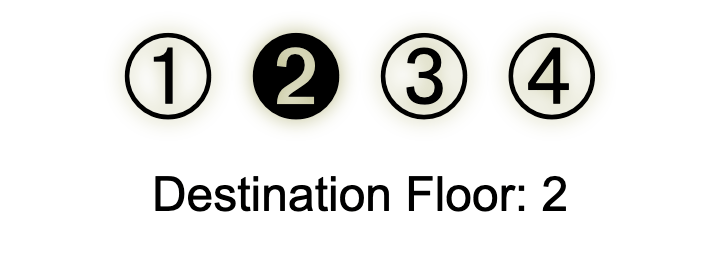
Displaying floor numbers elegantly became a joy thanks to CSS counters:
#floor-display:before {
  counter-reset: display var(--current-floor);
  content: counter(display, top-display);
}
I defined a custom counter style using Unicode circled numbers:
@counter-style top-display {
  system: cyclic;
  symbols: "278A" "2781" "2782" "2783";
  suffix: "";
}
The 278A to 2783 characters correspond to the ➊, ➋, ➌, ➃ symbols and give a unique, visual charm to the display. The elevator doesn’t just say “3,” but displays it with typographic flair. This approach is handy when you want to go beyond raw digits and apply symbolic or visual meaning using nothing but CSS.

Accessibility with aria-live
Accessibility matters. While CSS can’t change DOM text, it can still update screenreader-visible content using ::before and counter().
<div class="sr-only" aria-live="polite" id="floor-announcer"></div>#floor-announcer::before {
counter-reset: floor var(--current-floor);
content: "Now on floor " counter(floor);
}Add a .sr-only class to visually hide it but expose it to assistive tech:
.sr-only {
  position: absolute;
  width: 1px;
  height: 1px;
  overflow: hidden;
  clip: rect(0, 0, 0, 0);
  white-space: nowrap;
}
This keeps the experience inclusive and aligned with accessibility standards.
Practical Applications of These Techniques
This elevator is more than a toy. It’s a blueprint. Consider these real-world uses:
- Interactive prototypes without JavaScript
- Progress indicators in forms using live state
- Game UIs with inventory or status mechanics
- Logic puzzles or educational tools (CSS-only state tracking!)
- Reduced JavaScript dependencies for performance or sandboxed environments
These techniques are especially useful in static apps or restricted scripting environments (e.g., emails, certain content management system widgets).
Final Thoughts
What started as a small experiment turned into a functional CSS state machine that animates, signals direction, and announces changes, completely without JavaScript. Modern CSS can do more than we often give it credit for. With :has(), @property, counters, and a bit of clever math, you can build systems that are reactive, beautiful, and even accessible.
If you try out this technique, I’d love to see your take. And if you remix the elevator (maybe add more floors or challenges?), send it my way!


