I’m a big fan of Astro’s focus on developer experience (DX) and the onboarding of new developers. While the basic DX is strong, I can easily make a convoluted system that is hard to onboard my own developers to. I don’t want that to happen.
If I have multiple developers working on a project, I want them to know exactly what to expect from every component that they have at their disposal. This goes double for myself in the future when I’ve forgotten how to work with my own system!
To do that, a developer could go read each component and get a strong grasp of it before using one, but that feels like the onboarding would be incredibly slow. A better way would be to set up the interface so that as the developer is using the component, they have the right knowledge immediately available. Beyond that, it would bake in some defaults that don’t allow developers to make costly mistakes and alerts them to what those mistakes are before pushing code!
Enter, of course, TypeScript. Astro comes with TypeScript set up out of the box. You don’t have to use it, but since it’s there, let’s talk about how to use it to craft a stronger DX for our development teams.
Watch
Table of Contents
I’ve also recorded a video version of this article that you can watch if that’s your jam. Check it out on YouTube for chapters and closed captioning.
Setup
In this demo, we’re going to use a basic Astro project. To get this started, run the following command in your terminal and choose the “Minimal” template.
npm create astro@latestThis will create a project with an index route and a very simple “Welcome” component. For clarity, I recommend removing the <Welcome /> component from the route to have a clean starting point for your project.
To add a bit of design, I’d recommend setting up Tailwind for Astro (though, you’re welcome to style your component however you would like including a style block in the component).
npx astro add tailwindOnce this is complete, you’re ready to write your first component.
Creating the basic Heading component
Let’s start by defining exactly what options we want to provide in our developer experience.
For this component, we want to let developers choose from any HTML heading level (H1-H6). We also want them to be able to choose a specific font size and font weight — it may seem obvious now, but we don’t want people choosing a specific heading level for the weight and font size, so we separate those concerns.
Finally, we want to make sure that any additional HTML attributes can be passed through to our component. There are few things worse than having a component and then not being able to do basic functionality later.
Let’s start by creating a simple component that allows the user to dynamically choose the HTML element they want to use. Create a new component at ./src/components/Heading.astro.
---
// ./src/component/Heading.astro
const { as } = Astro.props;
const As = as;
---

<As>
  <slot />
</As>
To use a prop as a dynamic element name, we need the variable to start with a capital letter. We can define this as part of our naming convention and make the developer always capitalize this prop in their use, but that feels inconsistent with how most naming works within props. Instead, let’s keep our focus on the DX, and take that burden on for ourselves.
In order to dynamically register an HTML element in our component, the variable must start with a capital letter. We can convert that in the frontmatter of our component. We then wrap all the children of our component in the <As> component by using Astro’s built-in <slot /> component.
Now, we can use this component in our index route and render any HTML element we want. Import the component at the top of the file, and then add <h1> and <h2> elements to the route.
---
// ./src/pages/index.astro
import Layout from '../layouts/Layout.astro';
import Heading from '../components/Heading.astro';

---

<Layout>
  <Heading as="h1">Hello!</Heading>
  <Heading as="h2">Hello world</Heading>
</Layout>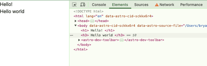
This will render them correctly on the page and is a great start.
Adding more custom props as a developer interface
Let’s clean up the element choosing by bringing it inline to our props destructuring, and then add in additional props for weight, size, and any additional HTML attributes.
To start, let’s bring the custom element selector into the destructuring of the Astro.props object. At the same time, let’s set a sensible default so that if a developer forgets to pass this prop, they still will get a heading.
---
// ./src/component/Heading.astro
const { as: As="h2" } = Astro.props;
---

<As>
  <slot />
</As>
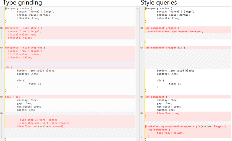
Next, we’ll get weight and size. Here’s our next design choice for our component system: do we make our developers know the class names they need to use or do we provide a generic set of sizes and do the mapping ourselves? Since we’re building a system, I think it’s important to move away from class names and into a more declarative setup. This will also future-proof our system by allowing us to change out the underlying styling and class system without affecting the DX.
Not only do we future proof it, but we also are able to get around a limitation of Tailwind by doing this. Tailwind, as it turns out can’t handle dynamically-created class strings, so by mapping them, we solve an immediate issue as well.
In this case, our sizes will go from small (sm) to six times the size (6xl) and our weights will go from “light” to “bold”.
Let’s start by adjusting our frontmatter. We need to get these props off the Astro.props object and create a couple objects that we can use to map our interface to the proper class structure.
---
// ./src/component/Heading.astro

const weights = {
    "bold": "font-bold",
    "semibold": "font-semibold",
    "medium": "font-medium",
    "light": "font-light"
}
const sizes= {
    "6xl": "text-6xl",
    "5xl": "text-5xl",
    "4xl": "text-4xl",
    "3xl": "text-3xl",
    "2xl": "text-2xl",
    "xl": "text-xl",
    "lg": "text-lg",
    "md": "text-md",
    "sm": "text-sm"
}

const { as: As="h2", weight="medium", size="2xl" } = Astro.props;
---
Depending on your use case, this amount of sizes and weights might be overkill. The great thing about crafting your own component system is that you get to choose and the only limitations are the ones you set for yourself.
From here, we can then set the classes on our component. While we could add them in a standard class attribute, I find using Astro’s built-in class:list directive to be the cleaner way to programmatically set classes in a component like this. The directive takes an array of classes that can be strings, arrays themselves, objects, or variables. In this case, we’ll select the correct size and weight from our map objects in the frontmatter.
---
// ./src/component/Heading.astro

const weights = {
  bold: "font-bold",
  semibold: "font-semibold",
  medium: "font-medium",
  light: "font-light",
};
const sizes = {
  "6xl": "text-6xl",
  "5xl": "text-5xl",
  "4xl": "text-4xl",
  "3xl": "text-3xl",
  "2xl": "text-2xl",
  xl: "text-xl",
  lg: "text-lg",
  md: "text-md",
  sm: "text-sm",
};

const { as: As = "h2", weight = "medium", size = "2xl" } = Astro.props;
---

<As class:list={[
  sizes[size],
  weights[weight]
]}
>
  <slot />
</As>
Your front-end should automatically shift a little in this update. Now your font weight will be slightly thicker and the classes should be applied in your developer tools.
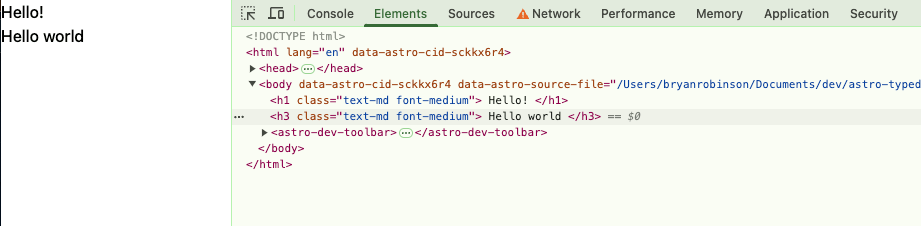
From here, add the props to your index route, and find the right configuration for your app.
---
// ./src/pages/index.astro
import Layout from '../layouts/Layout.astro';
import Heading from '../components/Heading.astro';
---

<Layout>
  <Heading as="h1" size="6xl" weight="light">Hello!</Heading>
  <Heading as="h3" size="xl" weight="bold">Hello world</Heading>
</Layout>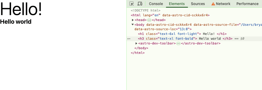
Our custom props are finished, but currently, we can’t use any default HTML attributes, so let’s fix that.
Adding HTML attributes to the component
We don’t know what sorts of attributes our developers will want to add, so let’s make sure they can add any additional ones they need.
To do that, we can spread any other prop being passed to our component, and then add them to the rendered component.
---
// ./src/component/Heading.astro

const weights = {
  // etc.
};
const sizes = {
  // etc.
};

const { as: As = "h2", weight = "medium", size = "md", ...attrs } = Astro.props;
---

<As class:list={[
  sizes[size],
  weights[weight]
]}
{...attrs}
>
  <slot />
</As>
From here, we can add any arbitrary attributes to our element.
---
// ./src/pages/index.astro
import Layout from '../layouts/Layout.astro';
import Heading from '../components/Heading.astro';

---

<Layout>
  <Heading id="my-id" as="h1" size="6xl" weight="light">Hello!</Heading>
  <Heading class="text-blue-500" as="h3" size="xl" weight="bold">Hello world</Heading>
</Layout>
I’d like to take a moment to truly appreciate one aspect of this code. Our <h1>, we add an id attribute. No big deal. Our <h3>, though, we’re adding an additional class. My original assumption when creating this was that this would conflict with the class:list set in our component. Astro takes that worry away. When the class is passed and added to the component, Astro knows to merge the class prop with the class:list directive and automatically makes it work. One less line of code!
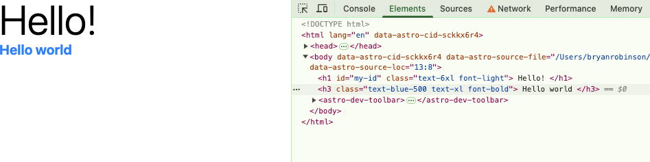
In many ways, I like to consider these additional attributes as “escape hatches” in our component library. Sure, we want our developers to use our tools exactly as intended, but sometimes, it’s important to add new attributes or push our design system’s boundaries. For this, we allow them to add their own attributes, and it can create a powerful mix.
It looks done, but are we?
At this point, if you’re following along, it might feel like we’re done, but we have two issues with our code right now: (1) our component has “red squiggles” in our code editor and (2) our developers can make a BIG mistake if they choose.
The red squiggles come from type errors in our component. Astro gives us TypeScript and linting by default, and sizes and weights can’t be of type: any. Not a big deal, but concerning depending on your deployment settings.
The other issue is that our developers don’t have to choose a heading element for their heading. I’m all for escape hatches, but only if they don’t break the accessibility and SEO of my site.
Imagine, if a developer used this with a div instead of an h1 on the page. What would happen?We don’t have to imagine, make the change and see.
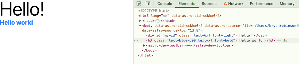
It looks identical, but now there’s no <h1> element on the page. Our semantic structure is broken, and that’s bad news for many reasons. Let’s use typing to help our developers make the best decisions and know what options are available for each prop.
Adding types to the component
To set up our types, first we want to make sure we handle any HTML attributes that come through. Astro, again, has our backs and has the typing we need to make this work. We can import the right HTML attribute types from Astro’s typing package. Import the type and then we can extend that type for our own props. In our example, we’ll select the h1 types, since that should cover most anything we need for our headings.
Inside the Props interface, we’ll also add our first custom type. We’ll specify that the as prop must be one of a set of strings, instead of just a basic string type. In this case, we want it to be h1–h6 and nothing else.
---
// ./src/component/Heading.astro
import type { HTMLAttributes } from 'astro/types';

interface Props extends HTMLAttributes<'h1'> {
  as: "h1" | "h2" | "h3" | "h4" | "h5" | "h6";
}

//... The rest of the file
---
After adding this, you’ll note that in your index route, the <h1> component should now have a red underline for the as="div" property. When you hover over it, it will let you know that the as type does not allow for div and it will show you a list of acceptable strings.
If you delete the div, you should also now have the ability to see a list of what’s available as you try to add the string.
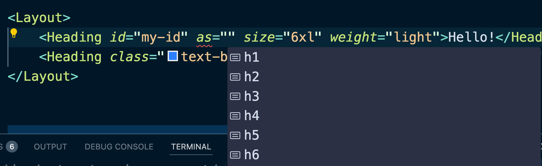
While it’s not a big deal for the element selection, knowing what’s available is a much bigger deal to the rest of the props, since those are much more custom.
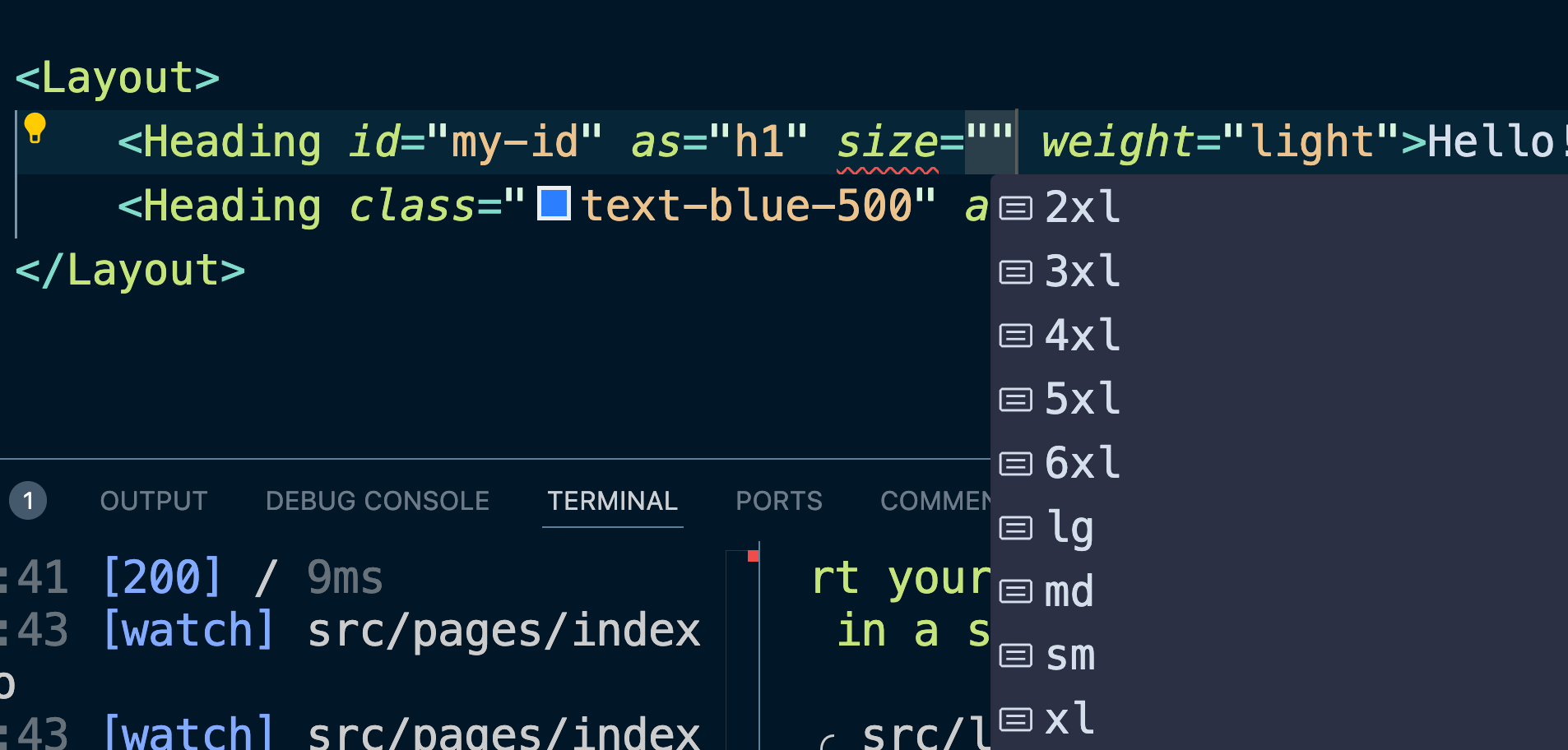
Let’s extend the custom typing to show all the available options. We also denote these items as optional by using the ?:before defining the type.
While we could define each of these with the same type functionality as our as type, that doesn’t keep this future proofed. If we add a new size or weight, we’d have to make sure to update our type. To solve this, we can use a fun trick in TypeScript: keyof typeof.
There are two helper functions in TypeScript that will help us convert our weights and sizes object maps into string literal types:
typeof: This helper takes an object and converts it to a type. For instancetypeof weightswould returntype { bold: string, semibold: string, ...etc}keyof: This helper function takes a type and returns a list of string literals from that type’s keys. For instancekeyof type { bold: string, semibold: string, ...etc}would return"bold" | "semibold" | ...etcwhich is exactly what we want for both weights and sizes.
---
// ./src/component/Heading.astro
import type { HTMLAttributes } from 'astro/types';

interface Props extends HTMLAttributes<'h1'> {
  as: "h1" | "h2" | "h3" | "h4" | "h5" | "h6";
  weight?: keyof typeof weights;
  size?: keyof typeof sizes;
}

// ... The rest of the file
Now, when we want to add a size or weight, we get a dropdown list in our code editor showing exactly what’s available on the type. If something is selected, outside the list, it will show an error in the code editor helping the developer know what they missed.
While none of this is necessary in the creation of Astro components, the fact that it’s built in and there’s no additional tooling to set up means that using it is very easy to opt into.
I’m by no means a TypeScript expert, but getting this set up for each component takes only a few additional minutes and can save a lot of time for developers down the line (not to mention, it makes onboarding developers to your system much easier).