CSS gradients have been so long that there’s no need to rehash what they are and how to use them. You have surely encountered them at some point in your front-end journey, and if you follow me, you also know that I use them all the time. I use them for CSS patterns, nice CSS decorations, and even CSS loaders. But even so, gradients have a tough syntax that can get very complicated very quickly if you’re not paying attention.
In this article, we are not going to make complex stuff with CSS gradients. Instead, we’re keeping things simple and I am going to walk through all of the incredible things we can do with just one gradient.
Only one gradient? In this case, reading the doc should be enough, no?
No, not really. Follow along and you will see that gradients are easy at their most basic, but are super powerful if we push them — or in this case, just one — to their limits.
CSS patterns
Table of Contents
One of the first things you learn with gradients is that we can establish repeatable patterns with them. You’ve probably seen some examples of checkerboard patterns in the wild. That’s something we can quickly pull off with a single CSS gradient. In this case, we can reach for the repeating-conic-gradient() function:
background:
  repeating-conic-gradient(#000 0 25%, #fff 0 50%)
0 / 100px 100px;A more verbose version of that without the background shorthand:
background-image: repeating-conic-gradient(#000 0 25%, #fff 0 50%);
background-size: 100px 100px;
Either way, the result is the same:
Pretty simple so far, right? You have two colors that you can easily swap out for other colors, plus the background-size property to control the square shapes.
If we change the color stops — where one color stops and another starts — we get another cool pattern based on triangles:
background:
  repeating-conic-gradient(#000 0 12.5%, #fff 0 25%)
  0 / 100px 100px;
If you compare the CSS for the two demos we’ve seen so far, you’ll see that all I did was divide the color stops in half, 25% to 12.5% and 50% to 25%.
Another one? Let’s go!
This time I’m working with CSS variables. I like this because variables make it infinitely easier to configure the gradients by updating a few values without actually touching the syntax. The calculation is a little more complex this time around, as it relies on trigonometric functions to get accurate values.
I know what you are thinking: Trigonometry? That sounds hard. That is certainly true, particularly if you’re new to CSS gradients. A good way to visualize the pattern is to disable the repetition using the no-repeat value. This isolates the pattern to one instance so that you clearly see what’s getting repeated. The following example declares background-image without a background-size so you can see the tile that repeats and better understand each gradient:
I want to avoid a step-by-step tutorial for each and every example we’re covering so that I can share lots more examples without getting lost in the weeds. Instead, I’ll point you to three articles you can refer to that get into those weeds and allow you to pick apart our examples.
I’ll also encourage you to open my online collection of patterns for even more examples. Most of the examples are made with multiple gradients, but there are plenty that use only one. The goal of this article is to learn a few “single gradient” tricks — but the ultimate goal is to be able to combine as many gradients as possible to create cool stuff!
Grid lines
Let’s start with the following example:
You might claim that this belongs under “Patterns” — and you are right! But let’s make it more flexible by adding variables for controlling the thickness and the total number of cells. In other words, let’s create a grid!
.grid-lines {
  --n: 3; /* number of rows */
  --m: 5; /* number of columns */
  --s: 80px; /* control the size of the grid */
  --t: 2px; /* the thickness */

  width: calc(var(--m)*var(--s) + var(--t));
  height: calc(var(--n)*var(--s) + var(--t));
  background:
    conic-gradient(from 90deg at var(--t) var(--t), #0000 25%, #000 0)
      0 0/var(--s) var(--s);
}
First of all, let’s isolate the gradient to better understand the repetition (like we did in the previous section).
One repetition will give us a horizontal and a vertical line. The size of the gradient is controlled by the variable --s, so we define the width and height as a multiplier to get as many lines as we want to establish the grid pattern.
What’s with “
+ var(--t)” in the equation?
The grid winds up like this without it:
We are missing lines at the right and the bottom which is logical considering the gradient we are using. To fix this, the gradient needs to be repeated one more time, but not at full size. For this reason, we are adding the thickness to the equation to have enough space for the extra repetition and the get the missing lines.
And what about a responsive configuration where the number of columns depends on the available space? We remove the --m variable and define the width like this:
width: calc(round(down, 100%, var(--s)) + var(--t));Instead of multiplying things, we use the round() function to tell the browser to make the element full width and round the value to be a multiple of --s. In other words, the browser will find the multiplier for us!
Resize the below and see how the grid behaves:
In the future, we will also be able to do this with the calc-size() function:
width: calc-size(auto, round(down, size, var(--s)) + var(--t));Using calc-size() is essentially the same as the last example, but instead of using 100% we consider auto to be the width value. It’s still early to adopt such syntax. You can test the result in the latest version of Chrome at the time of this writing:
Dashed lines
Let’s try something different: vertical (or horizontal) dashed lines where we can control everything.
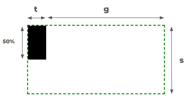
.dashed-lines {
  --t: 2px;  /* thickness of the lines */
  --g: 50px; /* gap between lines */
  --s: 12px; /* size of the dashes */

  background:
    conic-gradient(at var(--t) 50%, #0000 75%, #000 0)
    var(--g)/calc(var(--g) + var(--t)) var(--s);
}
Can you figure out how it works? Here is a figure with hints:
Try creating the horizontal version on your own. Here’s a demo that shows how I tackled it, but give it a try before peeking at it.
What about a grid with dashed lines — is that possible?
Yes, but using two gradients instead of one. The code is published over at my collection of CSS shapes. And yes, the responsive behavior is there as well!
Rainbow gradient
How would you create the following gradient in CSS?
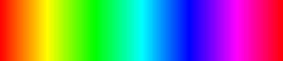
You might start by picking as many color values along the rainbow as you can, then chaining them in a linear-gradient:
linear-gradient(90deg, red, yellow, green, /* etc. */, red);Good idea, but it won’t get you all the way there. Plus, it requires you to juggle color stops and fuss with them until you get things just right.
There is a simpler solution. We can accomplish this with just one color!
background: linear-gradient(90deg in hsl longer hue, red 0 0);I know, the syntax looks strange if you’re seeing the new color interpolation for the first time.
If I only declare this:
background: linear-gradient(90deg, red, red); /* or (90deg, red 0 0) */…the browser creates a gradient that goes from red to red… red everywhere! When we set this “in hsl“, we’re changing the color space used for the interpolation between the colors:
background: linear-gradient(90deg in hsl, red, red);Now, the browser will create a gradient that goes from red to red… this time using the HSL color space rather than the default RGB color space. Nothing changes visually… still see red everywhere.
The longer hue bit is what’s interesting. When we’re in the HSL color space, the hue channel’s value is an angle unit (e.g., 25deg). You can see the HSL color space as a circle where the angle defines the position of the color within that circle.
Since it’s a circle, we can move between two points using a “short” path or “long” path.
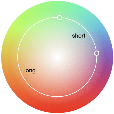
If we consider the same point (red in our case) it means that the “short” path contains only red and the “long” path runs into all the colors as it traverses the color space.
Adam Argyle published a very detailed guide on high-definition colors in CSS. I recommend reading it because you will find all the features we’re covering (this section in particular) to get more context on how everything comes together.
We can use the same technique to create a color wheel using a conic-gradient:
background: conic-gradient(in hsl longer hue,red 0 0);And while we are on the topic of CSS colors, I shared another fun trick that allows you to define an array of color values… yes, in CSS! And it only uses a single gradient as well.
Hover effects
Let’s do another exercise, this time working with hover effects. We tend to rely on pseudo-elements and extra elements when it comes to things like applying underlines and overlays on hover, and we tend to forget that gradients are equally, if not more, effective for getting the job done.
Case in point. Let’s use a single gradient to form an underline that slides on hover:
h3 {
  background:
    linear-gradient(#1095c1 0 0) no-repeat
    var(--p,0) 100%/var(--p, 0) .1em;
  transition: 0.4s, background-position 0s;
}

h3:hover {
  --p: 100%;
}
You likely would have used a pseudo-element for this, right? I think that’s probably how most people would approach it. It’s a viable solution but I find that using a gradient instead results in cleaner, more concise CSS.
You might be interested in another article I wrote for CSS-Tricks where I use the same technique to create a wide variety of cool hover effects.
CSS shapes
Creating shapes with gradients is my favorite thing to do in CSS. I’ve been doing it for what feels like forever and love it so much that I published a “Modern Guide for Making CSS Shapes” over at Smashing Magazine earlier this year. I hope you check it out not only to learn more tricks but to see just how many shapes we can create with such a small amount of code — many that rely only on a single CSS gradient.
Some of my favorites include zig-zag borders:
…and “scooped” corners:
…as well as sparkles:
…and common icons like the plus sign:
I won’t get into the details of creating these shapes to avoid making this article long and boring. Read the guide and visit my CSS Shape collection and you’ll have everything you need to make these, and more!
Border image tricks
Let’s do one more before we put a cap on this. Earlier this year, I discovered how awesome the CSS border-image property is for creating different kinds of decorations and shapes. And guess what? border-image limits us to using just one gradient, so we are obliged to follow that restriction.
Again, just one gradient and we get a bunch of fun results. I’ll drop in my favorites like I did in the last section. Starting with a gradient overlay:
We can use this technique for a full-width background:
…as well as heading dividers:
…and even ribbons:
All of these have traditionally required hacks, magic numbers, and other workarounds. It’s awesome to see modern CSS making things more effortless. Go read my article on this topic to find all the interesting stuff you can make using border-image.
Wrapping up
I hope you enjoyed this collection of “single-gradient” tricks. Most folks I know tend to use gradients to create, well, gradients. But as we’ve seen, they are more powerful and can be used for lots of other things, like drawing shapes.
I like to add a reminder at the end of an article like this that the goal is not to restrict yourself to using one gradient. You can use more! The goal is to get a better handle on how gradients work and push them in interesting ways — that, in turn, makes us better at writing CSS. So, go forth and experiment — I’d love to see what you make!