No feature is truly “the worst” in CSS, right? After all, it’s all based on opinion and personal experience, but if we had to reach a consensus, checking the State of CSS 2025 results would be a good starting point. I did exactly that, jumped into the awards section, and there I found it: the “Most Hated Feature,” a title no CSS should have bear…

This shocks me, if I’m being honest. Are really trigonometric functions really that hated? I know “hated” is not the same as saying something is “worst”, but it still has an awful ring to it. And I know I’m being a little dramatic here, since only “9.1% of respondents truly hate trigonometry.” But that’s still too much shade being thrown for my taste.
I want to eliminate that 9.1%. So, in this series, I want to look at practical uses for CSS trigonometric functions. We’ll tackle them in pieces because there’s a lot to take in and I find it easiest to learn and retain information when it’s chunked into focused, digestible pieces. And we’ll start with what may be the most popular functions of the “worst” feature: sin() and cos().
CSS Trigonometric Functions: The “Most Hated” CSS Feature
Table of Contents
sin()andcos()(You are here!)- Tackling the CSS
tan()Function (coming soon) - Inverse functions:
asin(),acos(),atan()andatan2()(coming soon)
What the heck are cos() and sin() anyway?
This section is for those who cos() and sin() don’t quite click yet, or simply want a refresher. If you aced trigonometry quizzes in high school, feel free to skip ahead to the next section!
What I find funny about cos() and sin()— and also why I think there is confusion around them — is the many ways we can describe them. We don’t have to look too hard. A quick glance at this Wikipedia page has an eye-watering number of super nuanced definitions.
This is a learning problem in the web development field. I feel like some of those definitions are far too general and lack detail about the essence of what trigonometric functions like sin() and cos() can do. Conversely, other definitions are overly complex and academic, making them tough to grok without an advanced degree.
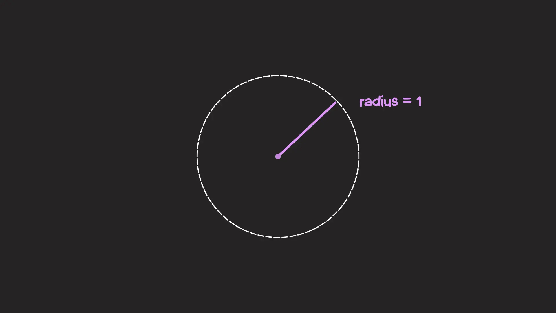
Let’s stick to the sweet middle spot: the unit circle.
Meet the unit circle. It is a circle with a radius of one unit:
Right now it’s alone… in space. Let’s place it on the Cartesian coordinate system (the classic chart with X and Y axes). We describe each point in space in Cartesian coordinates:
- The X coordinate: The horizontal axis, plotting the point towards the left or right.
- The Y coordinate: The vertical axis, plotting the point towards the top or bottom.
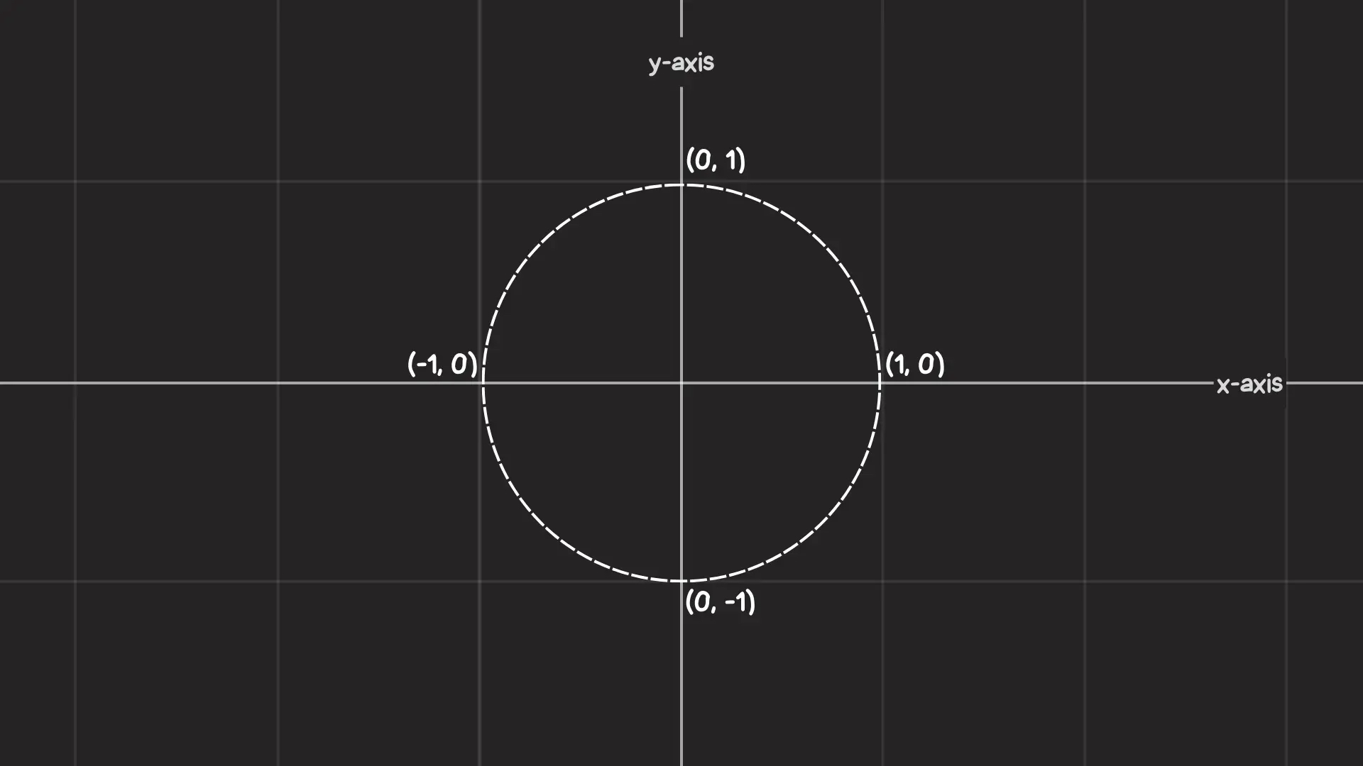
We can move through the unit circle by an angle, which is measured from the positive X-axis going counter-clockwise.
We can go in a clockwise direction by using negative angles. As my physics teacher used to say, “Time is negative!”
Notice how each angle lands on a unique point in the unit circle. How else can we describe that point using Cartesian coordinates?
When the angle is 0° the X and Y coordinates are 1 and 0 (1, 0), respectively. We can deduce the Cartesian coordinates for other angles just as easily, like 90°, 180° and 270°. But for any other angle, we don’t know where the point is initially located on the unit circle.
If only there were a pair of functions that take an angle and give us our desired coordinates…
You guessed it, the CSS cos() and sin() functions do exactly that. And they’re very closely related, where cos() is designed to handle the X coordinate and sin() returns the Y coordinate.
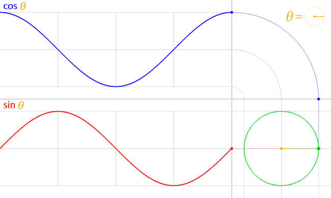
Play with the toggle slider in the following demo to see the relationship between the two functions, and notice how they form a right triangle with the initial point on the unit circle:
I think that’s all you really need to know about cos() and sin() for the moment. They’re mapped to Cartesian coordinates, which allows us to track a point along the unit circle with an angle, no matter what size that circle happens to be.
Let’s dive into what we can actually use cos() and sin() for our everyday CSS work. It’s always good to put a little real-world context to theoretical concepts like math.
Circular layouts
If we go by the unit circle definition of cos() and sin(), then it’s easy to see how they might be used to create circular layouts in CSS. The initial setup is a single row of circular elements:
Say we want to place each circular item around the outline of a larger circle instead. First, we would let CSS know the total number of elements and also each element’s index (the order it’s in), something we can do with an inline CSS variable that holds each order in the position:
<ul style="--total: 9">
  <li style="--i: 0">0</li>
  <li style="--i: 1">1</li>
  <li style="--i: 2">2</li>
  <li style="--i: 3">3</li>
  <li style="--i: 4">4</li>
  <li style="--i: 5">5</li>
  <li style="--i: 6">6</li>
  <li style="--i: 7">7</li>
  <li style="--i: 8">8</li>
</ul>
Note: This step will become much easier and concise when the sibling-index() and sibling-count() functions gain support (and they’re really neat). I’m hardcoding the indexes with inline CSS variables in the meantime.
To place the items around the outline of a larger circle, we have to space them evenly by a certain angle. And to get that angle, we can divide 360deg (a full turn around the circle) by the total number of items, which is 8 in this specific example. Then, to get each element’s specific angle, we can multiply the angle spacing by the element’s index (i.e., position):
li {
  --rotation: calc(360deg / var(--total) * var(--i));
}
We also need to push the items away from the center, so we’ll assign a --radius value for the circle using another variable.
ul {
  --radius: 10rem;
}
We have the element’s angle and radius. What’s left is to calculate the X and Y coordinates for each item.
That’s where cos() and sin() come into the picture. We use them to get the X and Y coordinates that place each item around the unit circle, then multiply each coordinate by the --radius value to get an item’s final position on the bigger circle:
li {
  /* ... */
  position: absolute;

  transform: translateX(calc(cos(var(--rotation)) * var(--radius)))
             translateY(calc(sin(var(--rotation)) * var(--radius)));
}
That’s it! We have a series of eight circular items placed evenly around the outline of a larger circle:
And we didn’t need to use a bunch of magic numbers to do it! All we provide CSS with is the unit circle’s radius, and then CSS does all the trigonometric gobbledygook that makes so many of us call this the “worst” CSS feature. Hopefully, I’ve convinced you to soften your opinions on them if that’s what was holding you back!
We aren’t limited to full circles, though! We can also have a semicircular arrangement by choosing 180deg instead of 360deg.
This opens up lots of layout possibilities. Like, what if we want a circular menu that expands from a center point by transitioning the radius of the circle? We can totally do that:
Click or hover the heading and the menu items form around the circle!
Wavy layouts
There’s still more we can do with layouts! If, say, we plot the cos() and sin() coordinates on a two-axis graph, notice how they give us a pair of waves that periodically go up and down. And notice they are offset from each other along the horizontal (X) axis:
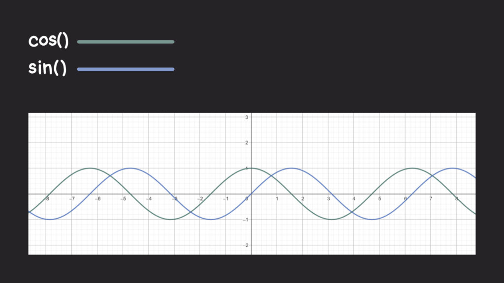
Where do these waves come from? If we think back to the unit circle we talked about earlier, the value of cos() and sin() oscillate between -1 and 1. In other words, the lengths match when the angle around the unit circle varies. If we graph that oscillation, then we’ll get our wave and see that they’re sorta like reflections of each other.
⚠️ Auto-playing media
Can we place an element following one of these waves? Absolutely. Let’s start with the same single row layout of circular items we made earlier. This time, though, the length of that row spans beyond the viewport, causing overflow.
We’ll assign an index position for each item like we did before, but this time we don’t need to know the total number of items. We had eight items last time, so let’s bump that up to 10 and pretend like we don’t know that:
<ul>
  <li style="--i: 0"></li>
  <li style="--i: 1"></li>
  <li style="--i: 2"></li>
  <li style="--i: 3"></li>
  <li style="--i: 4"></li>
  <li style="--i: 5"></li>
  <li style="--i: 6"></li>
  <li style="--i: 7"></li>
  <li style="--i: 8"></li>
  <li style="--i: 9"></li>
  <li style="--i: 10"></li>
</ul>
We want to vary the element’s vertical position along either a sin() or cos() wave, meaning translating each item’s position based on its order in the index. We’ll multiply an item’s index by a certain angle that is passed into the sin() function, and that will return a ratio that describes how high or low the element should be on the wave. The final thing is to multiply that result by a length value, which I calculated as half an item’s total size.
Here’s the math in CSS-y terms:
li {
  transform: translateY(calc(sin(60deg * var(--i)) * var(--shape-size) / 2));
}
I’m using a 60deg value because the waves it produces are smoother than some other values, but we can vary it as much as we want to get cooler waves. Play around with the toggle in the next demo and watch how the wave’s intensity changes with the angle:
This is a great example to see what we’re working with, but how would you use it in your work? Imagine we have two of these wavy chains of circles, and we want to intertwine them together, kinda like a DNA strand.
Let’s say we’re starting with the HTML structure for two unordered lists nested inside another unordered list. The two nested unordered lists represent the two waves that form the chain pattern:
<ul class="waves">
  <!-- First wave -->
  <li>
    <ul class="principal">
      <!-- Circles -->
      <li style="--i: 0"></li>
      <li style="--i: 1"></li>
      <li style="--i: 2"></li>
      <li style="--i: 3"></li>
      <!-- etc.  -->
    </ul>
  </li>

  <!-- Second wave -->
  <li>
    <ul class="secondary">
      <!-- Circles -->
      <li style="--i: 0"></li>
      <li style="--i: 1"></li>
      <li style="--i: 2"></li>
      <li style="--i: 3"></li>
      <!-- etc.  -->
    </ul>
  </li>
</ul>
Pretty similar to the examples we’ve seen so far, right? We’re still working with an unordered list where the items are indexed with a CSS variable, but now we’re working with two of those lists… and they’re contained inside a third unordered list. We don’t have to structure this as lists, but I decided to leave them so I can use them as hooks for additional styling later.
To avoid any problems, we’ll ignore the two direct <li> elements in the outer unordered list that contain the other lists using display: contents.
.waves > li { display: contents; }Notice how one of the chains is the “principal” while the other is the “secondary.” The difference is that the “secondary” chain is positioned behind the “principal” chain. I’m using slightly different background colors for the items in each chain, so it’s easier to distinguish one from the other as you scroll through the block-level overflow.
We can reorder the chains using a stacking context:
.principal {
  position: relative;
  z-index: 2;
}

.secondary { position: absolute; }
This positions one chain on top of the other. Next, we will adjust each item’s vertical position with the “hated” sin() and cos() functions. Remember, they’re sorta like reflections of one another, so the variance between the two is what offsets the waves to form two intersecting chains of items:
.principal {
  /* ... */
  li {
    transform: translateY(calc(sin(60deg * var(--i)) * var(--shape-size) / 2));
  }
}

.secondary {
  /* ... */
  li {
    transform: translateY(calc(cos(60deg * var(--i)) * var(--shape-size) / 2));
  }
}
We can accentuate the offset even more by shifting the .secondary wave another 60deg:
.secondary {
  /* ... */
  li {
    transform: translateY(calc(cos(60deg * var(--i) + 60deg) * var(--shape-size) / 2));
  }
}
The next demo shows how the waves intersect at an offset angle of 60deg. Adjust the slider toggle to see how the waves intersect at different angles:
Oh, I told you this could be used in a practical, real-world way. How about adding a little whimsy and flair to a hero banner:
Damped oscillatory animations
The last example got me thinking: is there a way to use sin() and cos()‘s back and forth movement for animations? The first example that came to mind was an animation that also went back and forth, something like a pendulum or a bouncing ball.
This is, of course, trivial since we can do it in a single animation declaration:
.element {
  animation: someAnimation 1s infinite alternate;
}
This “back and forth” animation is called oscillatory movement. And while cos() or sin() are used to model oscillations in CSS, it would be like reinventing the wheel (albeit a clunkier one).
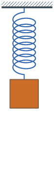
I’ve learned that perfect oscillatory movement — like a pendulum that swings back and forth in perpetuity, or a ball that never stops bouncing — doesn’t really exist. Movement tends to decay over time, like a bouncing spring:
⚠️ Auto-playing media
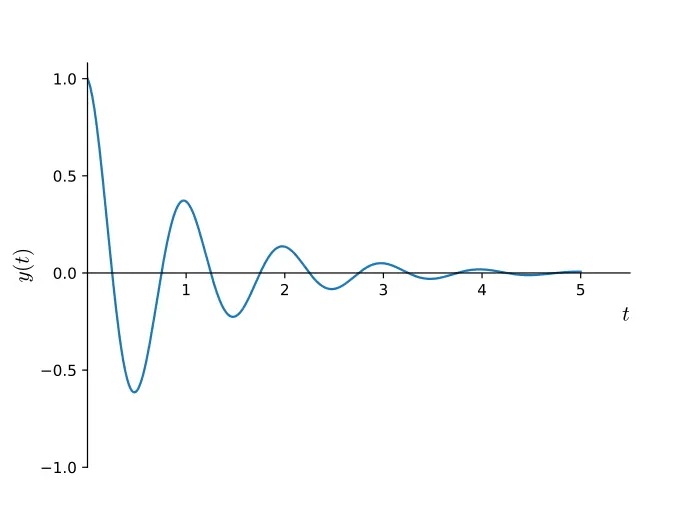
There’s a specific term that describes this: damped oscillatory movement. And guess what? We can model it in CSS with the cos() function! If we graph it over time, then we will see it goes back and forth while getting closer to the resting position1.
Wikipedia has another animated example that nicely demonstrates what damped oscillation looks like.
In general, we can describe damped oscillation over time as a mathematical function:
It’s composed of three parts:
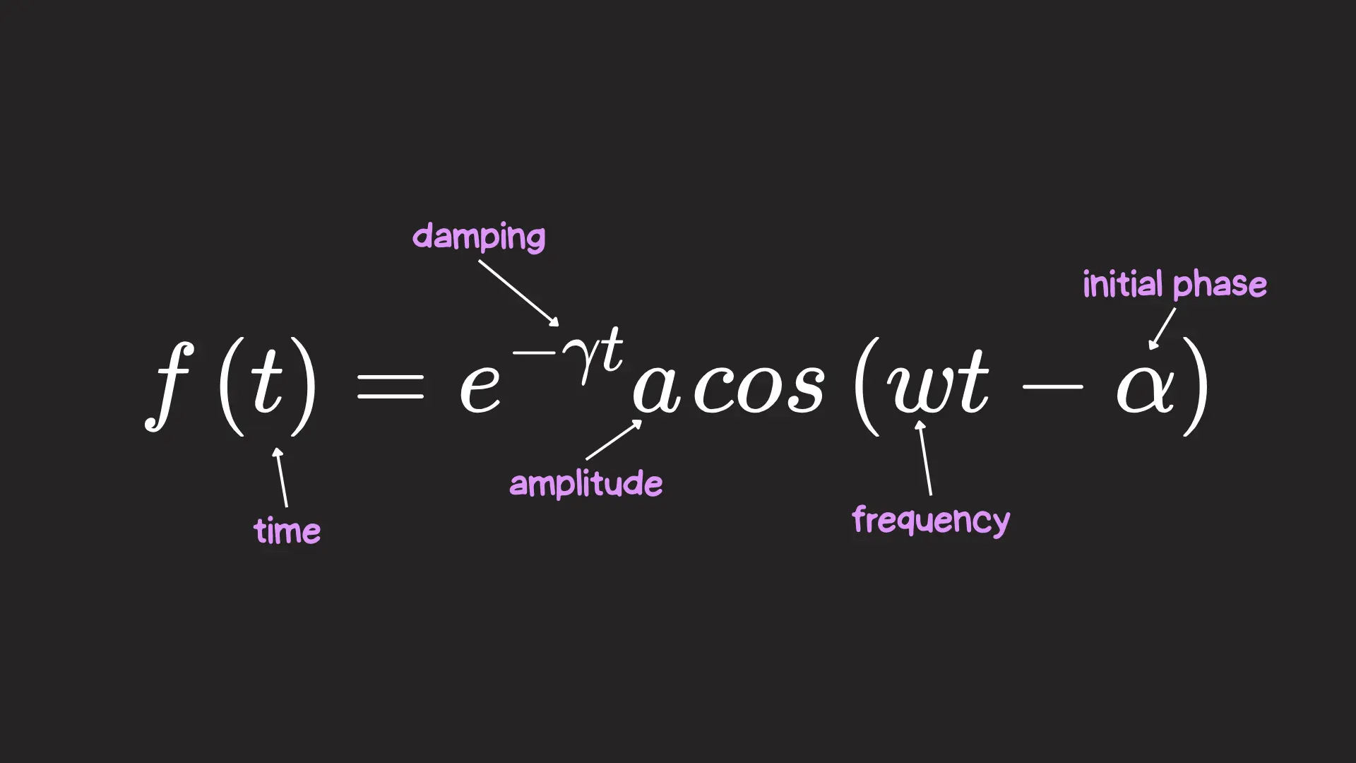
- e−γt: Due to the negative exponent, it becomes exponentially smaller as time passes, bringing the movement to a gradual stop. It is multiplied by a damping constant (γ) that specifies how quickly the movement should decay.
- a: This is the initial amplitude of the oscillation, i.e., the element’s initial position.
- cos(ωt−α): This gives the movement its oscillation as time passes. Time is multiplied by frequency (ω), which determines an element’s oscillation speed2. We can also subtract from time α, which we can use to offset the initial oscillation of the system.
Okay, enough with all the theory! How do we do it in CSS? We’ll set the stage with a single circle sitting all by itself.
We have a few CSS variables we can define that will come in handy since we already know the formula we’re working with:
:root {
  --circle-size: 60px;

  --amplitude: 200px; /* The amplitude is the distance, so let's write it in pixels*/
  --damping: 0.3;
  --frequency: 0.8;
  --offset: calc(pi/2); /* This is the same as 90deg! (But in radians) */
}
Given these variables, we can peek at what the animation would look like on a graph using a tool like GeoGebra:
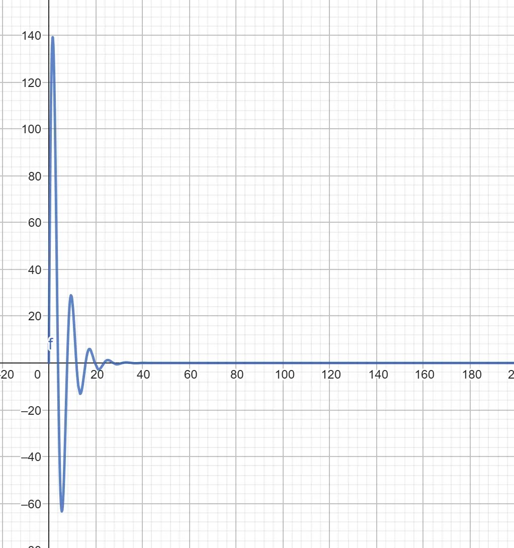
From the graph, we can see that the animation starts at 0px (thanks to our offset), then peaks around 140px and dies out around 25s in. I, for one, won’t be waiting 25 seconds for the animation to end, so let’s create a --progress property that will animate between 0 to 25, and will act as our “time” in the function.
Remember that to animate or transition a custom property, we’ve gotta register it with the @property at-rule.
@property --progress {
  syntax: "<number>";
  initial-value: 0;
  inherits: true;
}

@keyframes movement {
  from { --progress: 0; }
  to { --progress: 25; }
}
What’s left is to implement the prior formula for the element’s movement, which, written in CSS terms, looks like this:
.circle {
  --oscillation: calc(
    (exp(-1 * var(--damping) * var(--progress))) *
    var(--amplitude) *
    cos(var(--frequency) * (var(--progress)) - var(--offset))
  );

  transform: translateX(var(--oscillation));
  animation: movement 1s linear infinite;
}
This gives a pretty satisfying animation by itself, but the damped motion is only on the x-axis. What would it look like if, instead, we applied the damped motion on both axes? To do this, we can copy the same oscillation formula for x, but replace the cos() with sin().
.circle {
  --oscillation-x: calc(
    (exp(-1 * var(--damping) * var(--progress))) *
    var(--amplitude) *
    cos(var(--frequency) * (var(--progress)) - var(--offset))
  );
  --oscillation-y: calc(
    (exp(-1 * var(--damping) * var(--progress))) *
    var(--amplitude) *
    sin(var(--frequency) * (var(--progress)) - var(--offset))
  );

  transform: translateX(var(--oscillation-x)) translateY(var(--oscillation-y));
  animation: movement 1s linear infinite;
}
This is even more satisfying! A circular and damped motion, all thanks to cos() and sin(). Besides looking great, how could this be used in a real layout?
We don’t have to look too hard. Take, for example, this sidebar I recently made where the menu items pop in the viewport with a damped motion:
Pretty neat, right?!
More trigonometry to come!
Well, finding uses for the “most hated CSS feature” wasn’t that hard; maybe we should start showing some love to trigonometric functions. But wait. There are still several trigonometric functions in CSS we haven’t talked about. In the following posts, we’ll keep exploring what trig functions (like tan() and inverse functions) can do in CSS.
CSS Trigonometric Functions: The “Most Hated” CSS Feature
sin()andcos()(You are here!)- Tackling the CSS
tan()Function (coming soon) - Inverse functions:
asin(),acos(),atan()andatan2()(coming soon)
Also, before I forget, here is another demo I made using cos() and sin() that didn’t make the cut in this article, but it is still worth checking out because it dials up the swirly-ness from the last example to show how wacky we can get.
Footnotes
- This kind of damped oscillatory movement, where the back and forth is more visible, is called underdamped oscillation. There are also overdamped and critically damped oscillations, but we won’t focus on them here. ↪️
- In reality, the damped constant and the frequency are closely related. You can read more about damped oscillation in this paper. ↪️